In this Notes from the Fell article from Handwoven May/June 2016, Tom looks at color-and-weave, one of the most interesting aspects of weaving, that can sometimes seem like magic. -Susan
One of my very first weaving projects was a table runner in the log cabin pattern. I had been given this pattern by some very good authority and told that I would love it. Boy, did I ever love it! It was hard to believe that this two-dimensional pattern was happening on my old 2-shaft barn loom. The color contrast between the navy blue and Granny Smith apple green yarns in the warp and weft made the fabric look so textured that you wanted to run your hands over it to see if it had high and low areas. I stopped as I wove to look at the fabric from several angles: straight on, from the side of my loom, and then standing on the loom bench to see it from above. How is this even possible, I wondered? This is a simple plain weave, and all I did was alternate dark and light threads. Yes, I did have to consider some careful placement in the threading, but this was so easy to thread and weave, and the finished pattern was nothing short of fabulous. I came to learn that this newfound love affair, this weave structure had a name: color-and-weave.
The term color-and-weave was a little confusing to me at first. I thought it meant color theory in my fabric design, but I learned that the secret of color-and-weave is to have a strong contrast between the light and dark threads. That was it, pure and simple. I was now ready to collect and study all aspects of color-and-weave theory.

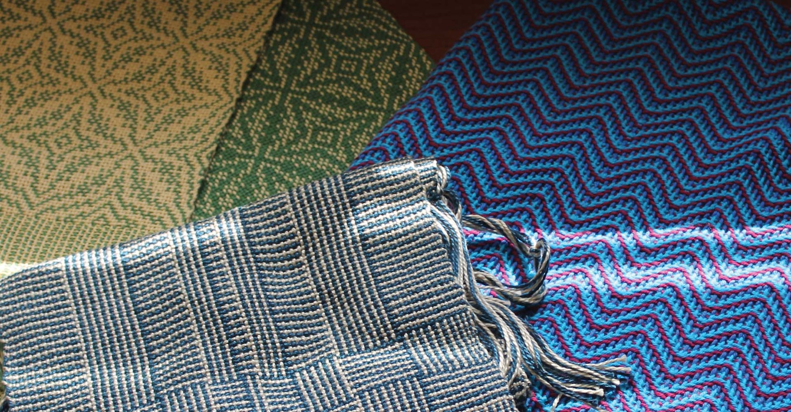
Alternating different colors in warp and weft give this shadow weave fabric extra depth and almost a crocheted appearance.
So here is what I found in my search. You can apply color-and-weave theory to many ways of weaving. You can weave balanced weave fabrics such as blankets, towels, weft-faced rugs, and heavier fabrics, and you can weave warp-faced structures such as rep weave that are great for rugs and runners. As long as you remember to pick colors that have strong contrast, you won’t be disappointed. Let me give you an example so you can learn from my mistakes. In the early 1980s, I decided to order a larger loom, and I bought an Öxabäck. In the time it took to build the loom and have it shipped from Sweden, I discovered shadow weave. There I was, beside myself with this new 16-shaft countermarch loom. It was just asking for a spectacular project to be warped for its maiden voyage. That’s it, I thought. The perfect project for my new loom will be shadow weave. At that time, American country decorating was all the rage. I thought a table runner in dusty rose and duck blue would make an attractive combination. The cones looked great sitting next to each other. The problem, I discovered pretty quickly, was that these two colors were of the same value, and when you alternate them thread for thread in both the warp and weft direction, you achieve a magnificent gray. I couldn’t believe it! All that work and for what! What was to be my fabulous maiden voyage turned out to be a sinking ship. I cut it off the loom and rewarped for some fancy twill towels that I could count on to be a success. I then thought about what went wrong in my color choice, and that’s when I learned the greatest lesson in color theory: the importance of picking threads with contrast.
As the years went on, I discovered new and exciting ways to weave with alternating threads of dark and light colors. In a book on Navajo rugs, I saw several examples with vertical striped lines that happened as a result of weaving alternating light and dark weft yarns. In this weft-faced, plain-weave structure, one dark weft pick covers all the odd-numbered threads in the warp while the next light-colored weft pick covers all the even-numbered warp ends. (This is sometimes called “pick and pick.”) As they slide down and interweave in the typical weft-faced manner, the result is narrow vertical stripes. The author called this style of weaving “railroad.” This seemed to be a most appropriate name because it looked just like railroad tracks.

Contrast spices up the weaving, but maybe this guy had a little too much spice.
It’s remarkable to me how you can throw a request out there to the universe and you get showered with answers and examples. They’re everywhere when you start to look about you. One day, I stumbled across a Canadian woven blanket at a local antique mall that I like to visit. The blanket also had vertical stripes, but the stripes were wider and thinner, and there were defined pattern blocks. I was to learn that this was a common way to weave warm wool blankets in Canada and the northernmost parts of New England. It’s known as rib weave. There were thick and thin linen threads alternating in the warpwise direction, and indigo blue wool and dark black wool in the weft direction. It was weft-faced. There are contrasts everywhere in this piece, I thought. There are heavy and fine threads in the warp and light and dark threads in the weft. It’s as if the weavers took a warp-faced rep weave and turned it 90 degrees. Now how cool is this, I ask you? When I think of rep weave, I think of wonderful warp-patterned rugs from Scandinavia. The basic principles that apply to rep weave and how the structure works can be found in numerous examples of antique warp-faced carpeting found here in my home area of central Pennsylvania. Weavers knew to alternate contrasting dark and light threads in the warp and threaded in a log cabin format. They then wove with two shuttles, one wound with a fine yarn and the other wound with rags or a very heavy yarn. These, too, were woven by alternating the fine with the heavy yarns, creating a checkerboard pattern.
Whether it is dark and light or thick and thin, I love to use contrasts to spice up my weaving. It’s like the world we live in, our community, and the people we know and love. Contrast and a little diversity is a wonderful thing.
Happy weaving,
Tom