Very long ago—I can remember like it was yesterday—a wise friend told me not to put all my weaving knowledge into the design of a single project. This happened before I’d heard of KISS, which stands for “Keep it simple, stupid,” or the even more popular idea of “less is more.”
My friend informed me that there are three elements to good design: Color, Texture, and Pattern. She said, “Use only two at any one time.” I have never forgotten those insightful words and think about them every time I plan a new project.
Color & Texture
Let’s start by examining the idea of color and texture with no pattern thrown into the equation. Waffle weave woven in a single color in both the warp and weft direction is a good example. The deep cells of the waffle structure add textural interest, and you can weave it in your favorite color of the moment. (I change my mind about my favorite color all the time. Don’t you?) To my eye, using one color for the warp and a different color for the weft would be distracting and take something away from the beautiful architectural elements of this structure. Imagine using a variegated color thread for this project; the color shifting would be a distraction.


Stripes are an easy way to modernize classic designs.
Texture & Pattern
The pairing of texture and pattern is a bit more of a challenge for me. If I have purchased a fabulous, variegated bouclé yarn from a dyer at a fiber festival, I might just sit on this thread for a while and think about how I am going to use it. Most likely, I will weave it into a plain-weave fabric to best show off the yarn—nothing too complex. Perhaps a simple twill would be appropriate, but only to give the finished cloth a better drape than I could get in plain weave. I hope I bought enough hypothetical yarn to sample!
I have been surprised from time to time with my choices of textured yarns in combination with a pattern. If the pattern has a clean and bold geometric design, a textured yarn can add amazing interest to the fabric. The clean breaks between the pattern blocks of summer and winter or crackle weave seem more suited for textured yarns than a structure like overshot that shares pattern blocks. Although as I learned, not everyone agrees with me.
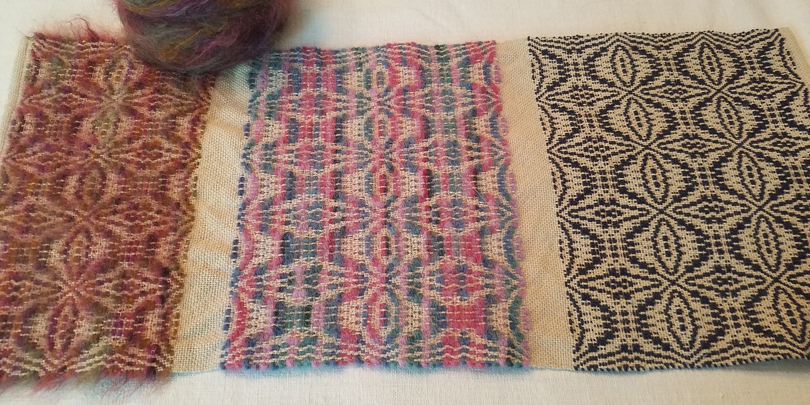
To illustrate this point about overshot, I wove the sample shown at the top of page 18. The pattern is Orange Peel (#10) from the Josephine Estes pattern book Original Miniature Patterns for Hand Weaving, Part I. I wove this first with navy-blue pearl cotton. Then I wove it again with a variegated worsted-weight knitting yarn. Finally, I wove it with a variegated brushed-wool yarn. “What a great example of what not to do,” I thought. Well, that thought came around to bite me because as I was weaving the sample, several people came into the studio and told me how pretty the variegated, brushed-wool example was. They loved it and told me that it reminded them of Fair Isle knitting. I was not expecting that response but could easily see what they were saying. It was a good reminder to sample and get other people’s opinions.

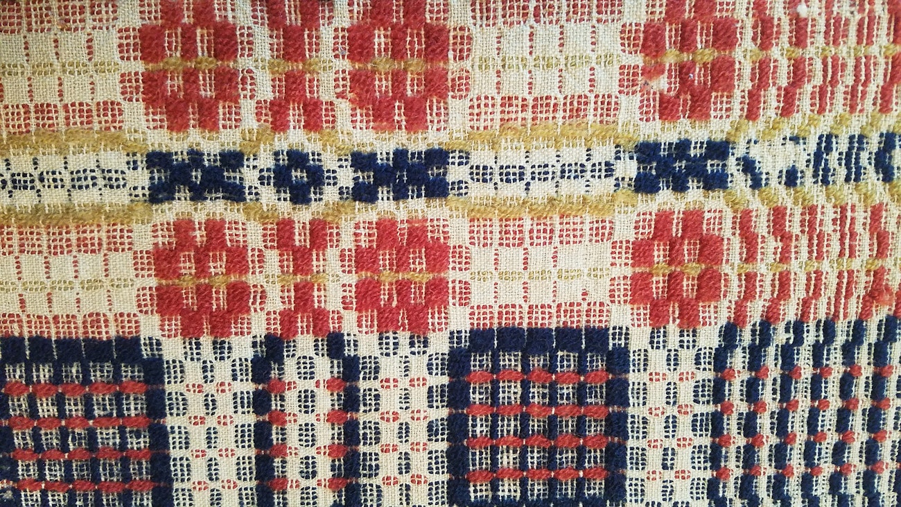
Overshot in more traditional colors
Color & Pattern
The final two elements, color and pattern, come easily for most people— myself included. Combining colors in an overshot pattern is like magic to my eye. It is easy to weave my favorite color into a neutral-colored warp, and I will sometimes add a second or third color and weave them in specific areas of the treadling to add interest to the design. I learned many of these tricks from looking at and studying the woven coverlets of weavers long ago.
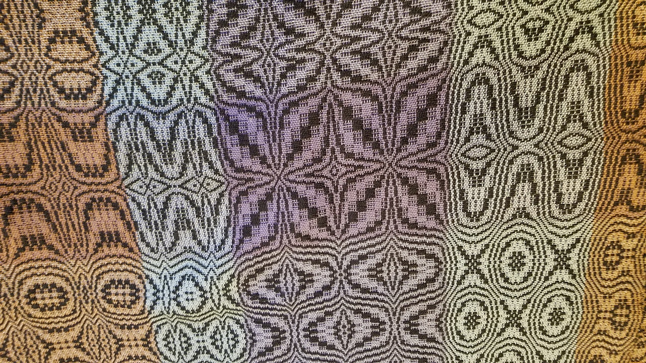
In the fabric at the top right, I tried to give a contemporary twist to an old pattern by weaving an overshot draft on a striped warp. I then changed out the tabby colors to give the overshot pattern a plaid ground cloth. What fun! Here is another example of a striped warp threaded to a simple M and W twill (bottom photo below). The weft is just a single color, and the resulting towel is one of my favorites.
Let us not forget the color-and-weave category. A simple log-cabin arrangement or shadow weave are perfect examples of color-and-weave fabrics. Just a simple choice of two contrasting colors and a pattern of your liking and you are off and weaving beautiful cloth. No textured yarns needed here.
Exceptions?
I’m often reminded to be more open-minded because there are sometimes exceptions to the rules. What if I added a thick-and-thin element to the color-and-weave idea? It is adding a textural interest to the mix, but it’s subtle and could be marvelous. Look at me, breaking the rules as I weave the sample.
My earlier comment about my overshot sample has me thinking. The very element I thought was distracting turned out to be beautiful to someone else. My eye prefers to weave overshot in the style of the eighteenth and nineteenth centuries—solid colors in a neutral-colored warp. What if variegated yarns had been available during that time and adopted and embraced as beautiful? Would they be considered beautiful now? We’ll never know, but I am reminded that some of the Impressionist masters sold very few paintings during their lifetimes. Today these works hang in major museums and are considered priceless. It sometimes takes a long time for us to adopt a new way of appreciating art . . . or fabric.
I will always turn to the design rule of two to help me in planning a project. I’ll let it perk about a little, but if the spirit moves me, I just may add a little slubby something-something to shake things up a bit. I have, from time to time, been known to be edgy.
I hope this inspires you to weave something fabulous.
Happy weaving,
Tom

