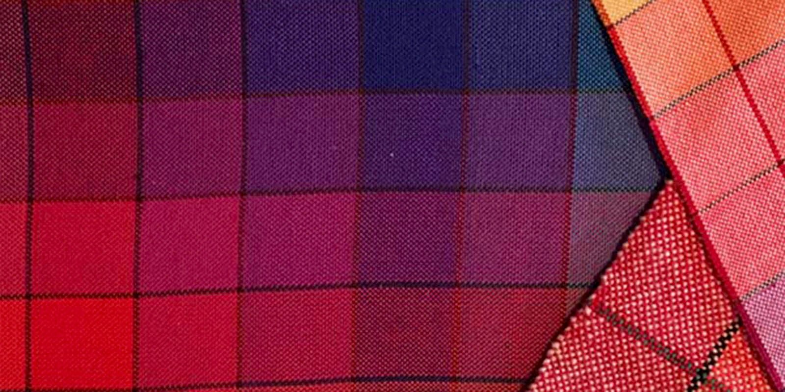
Color choice is a very personal thing, but, as anyone who’s ever created a muddy-looking weaving project knows, there is definitely some degree of right and wrong in weaving design. Once you know the ins and outs of choosing colors for weaving, you’ll be able to confidently combine colors that will complement each other and your weave structure. All you need is a guide!
As in so many other aspects of weaving and weaving design, Deb Essen is a wonderful instructor on color theory for weavers. In her new video, Color in Weaving: Successful Color Choices for Handwoven Cloth, she’ll walk you through all the steps of working with color as a weaver.
You’ll learn how to choose colors that will complement each other, how to predict the way colors will interact, and how to match your weave structure and desired effect to the colors you choose. You’ll also learn how factors like the thickness of your yarn, your weaving sett, and how firmly you beat the weft impact the way your colors show up in the final piece.
Finally, Deb will give you tons of exercises to improve your eye for color. Her goal is to help you think outside the box when it comes to color, allowing you to try out combinations you otherwise would never have considered.
Before you dive into color experimentation, you’ll need a few basic color theory terms under your belt. You’ve probably heard these terms before, but fully understanding their meaning will help you see why certain colors will or won’t work together in a weaving design.
Color Theory Terms for Weaving Design
True Hue: Colors at their purest form. True hues will always appear somewhere on your color wheel, but they are in different places on different wheels. Read the instructions to figure out which hues are the true hues. At left, you’ll see a cone of cobalt blue yarn that’s very close to the true hue on the outer ring of Deb’s color wheel.
Tints: Made by adding white to a pure hue.
Tones: Made by adding grey to a pure hue, which can either lighten or darken the color.
Shades: Made by adding black to a pure hue.
Saturation: How much of a pure hue there is in the color. It has nothing to do with the amount of color used to dye the yarn, or how dark the color is. Hues with more black, white, or grey added to the pure hue will be less saturated.
Value: Often described as the “weight” of the color, value describes how the color would look if it were converted to greyscale. It’s useful for comparing two or more colors to see how they will contrast with each other. Some color wheels have a greyscale on them to help you determine the value of colors.
The Value of Value
Value is the trickiest color theory term to understand, and it’s also where we get into trouble as weavers. If you use two colors that have similar values, you’ll end up with very low-contrast patterning. Sometimes, that’s just what you want! However, often you will want the crisper effect of using colors with very different values.
It’s difficult for an untrained eye to see value, but Deb will teach you a variety of techniques. Eventually, your eye and brain will tune in, and you’ll be able to better predict and control the results of your weaving.
Deb's passion for color is infectious. Soon you'll be confidently designing and experimenting with color on your own. Order a DVD or video download of Color in Weaving, and get ready to break out of your color rut!
– Andrea