Tien Chiu is well known for her fabulous weaving and use of color, but choosing colors for her projects was difficult for her at first. Read on for some rules about color theory in weaving that she learned through sampling and study. ~Susan
I am an unlikely artist. I was raised by an astrophysicist and an X-ray crystallographer. I majored in math at California Institute of Technology, a university that focused completely on science and engineering. Not only was I not an artist growing up, I didn’t even know any artists. Artists were exotic wizards from another planet.
When I became a weaver, I had no clue how to choose and use colors. I had disaster after disaster. I would pick brilliantly hued yarns and plan out a scarf, dreaming of bright, cheery colors. But when I wove it, I wound up with dull, muddy cloth.
Or I would pick “safe” color combinations, such as royal blue and violet—only to find that they were too safe, resulting in a shawl that looked like solid blue-violet. And let’s not even talk about what happened with painted warps!
It’s not surprising that I found color confusing. Color in weaving is more complicated than in other fiber arts, because in weaving, you are constantly blending warp and weft colors. In knitting, dyeing, or quilting, placing a patch of solid red next to a patch of solid blue is easy. But in weaving, solid areas of color are harder to achieve. When you use red warp and blue weft, you can produce many mixes of red and blue, but very few weave structures will produce solid red or solid blue.
To understand color in weaving, weavers need to understand not only color composition, but color mixing. Different weave structures blend colors very differently. Small wonder that many weavers find color unpredictable and intimidating!
Being a scientist at heart, I solved my color cluelessness through research and experimentation. I read every book I could find on color theory, dyed more than 2,500 yarn samples to get a better sense for color mixing, and wove hundreds of samples. In the end, I learned that color in weaving, while complex, is actually governed by a few basic rules. With an understanding of those rules and how to apply them, anyone can create beautiful handwoven cloth in the palette of his or her choice.
The small dots of color created by plain weave results in color mixing. Photo by Tien Chiu
Here are a couple of rules:
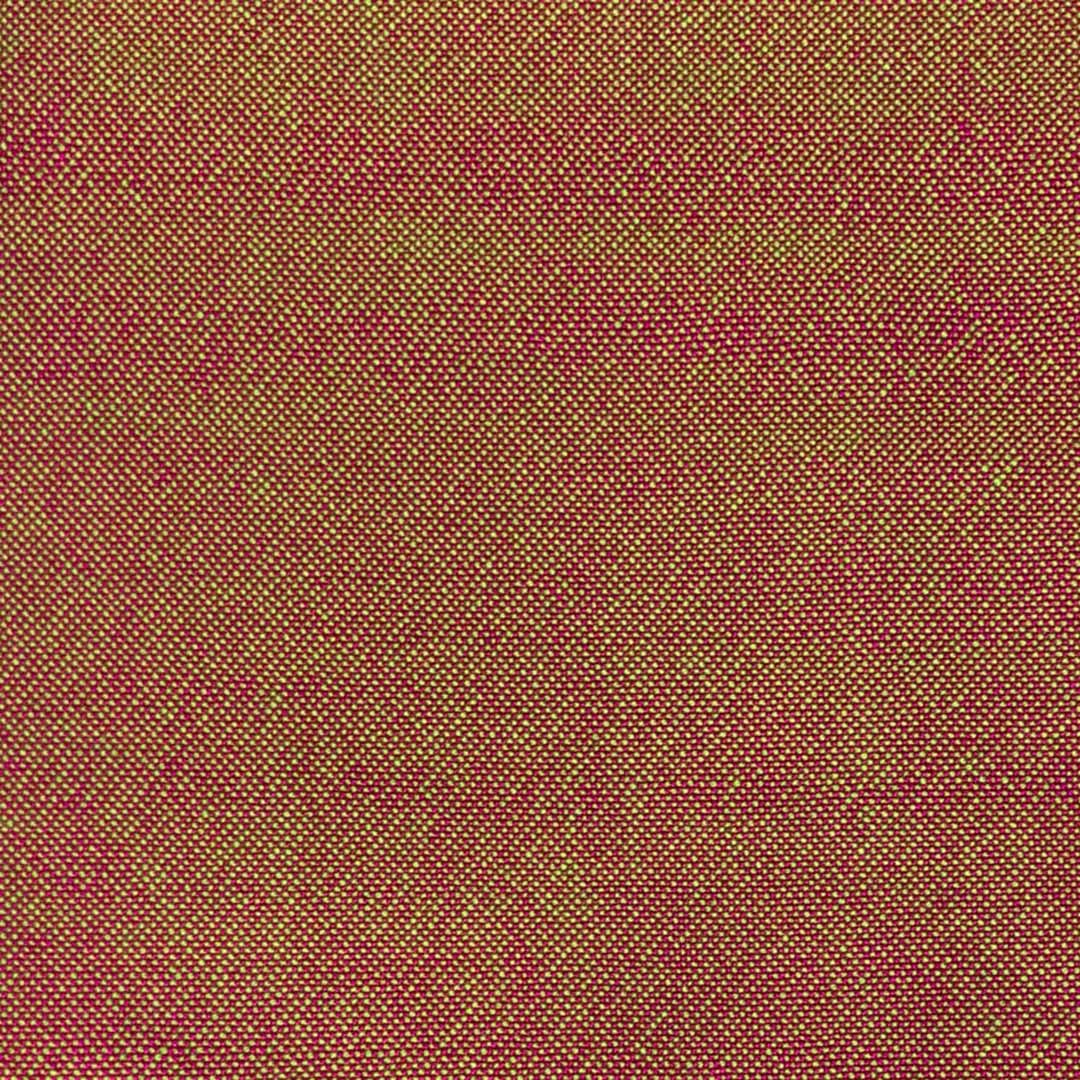
Rule 1. If you mix two colors in small dots, the eye will blend the hues together.
For example, mixing bright green with magenta in plain weave gives you brown. But mixing the same two colors in larger patches—such as these 1/3 vs. 3/1 twill blocks— makes them contrast more strongly with each other, producing brightly colored blocks of magenta and green.
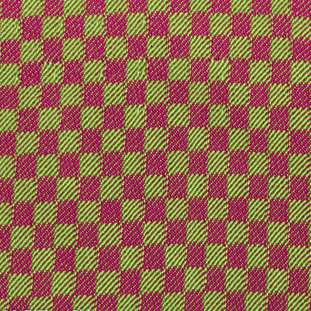
When the spots of color are larger, they don’t mix together when you look at them. Photo by Tien Chiu
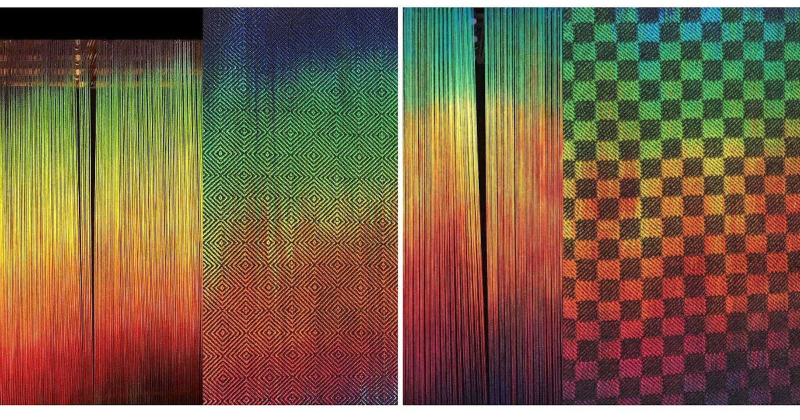
This principle applies to painted warps, too. The first painted warp is painted warp on the left was woven with a black weft in 2/2 bird’s-eye twill—small dots of color. The warp on the right was woven with the same black weft, but in 1/3 vs. 3/1 twill blocks. In the cloth on the left, the black blends with the painted warp, dulling and darkening the colors. In the other cloth, the larger patches of color “pop” the painted warp, giving a much brighter, more colorful fabric.
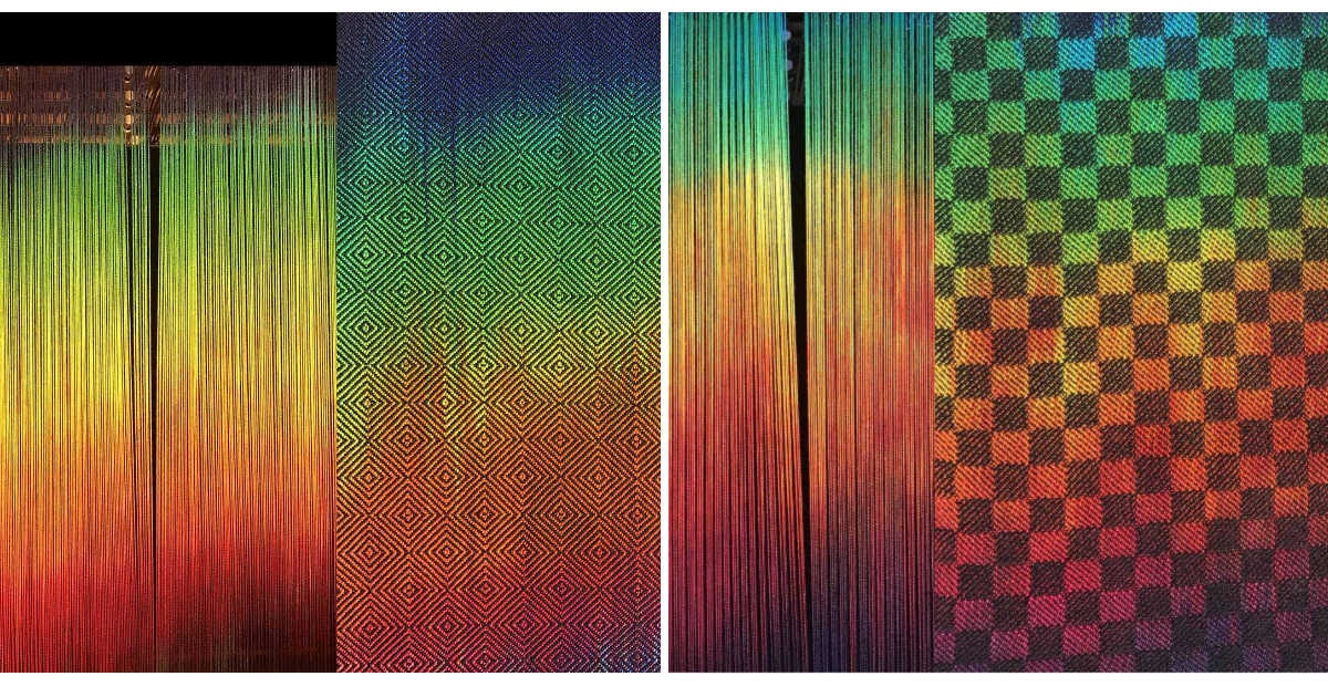
Compare the color mixing in the bird’s-eye twill on the left with the 3/1 twill on the right. Photo by Tien Chiu
Rule 2. The eye perceives differences in value very clearly—much more clearly than it sees any other aspect of color.
As a result, yarns with strong light/dark contrast will create a bold pattern in your handwoven cloth, while colors with equal values will blend into a subtle design. That makes it easy to figure out whether your woven pattern will show clearly in a given set of yarns. Just put the yarns next to each other, and snap a black-and-white photo with your smartphone. If you can see a clear difference between the yarns in the photo, your pattern will show clearly; if not, it won’t.
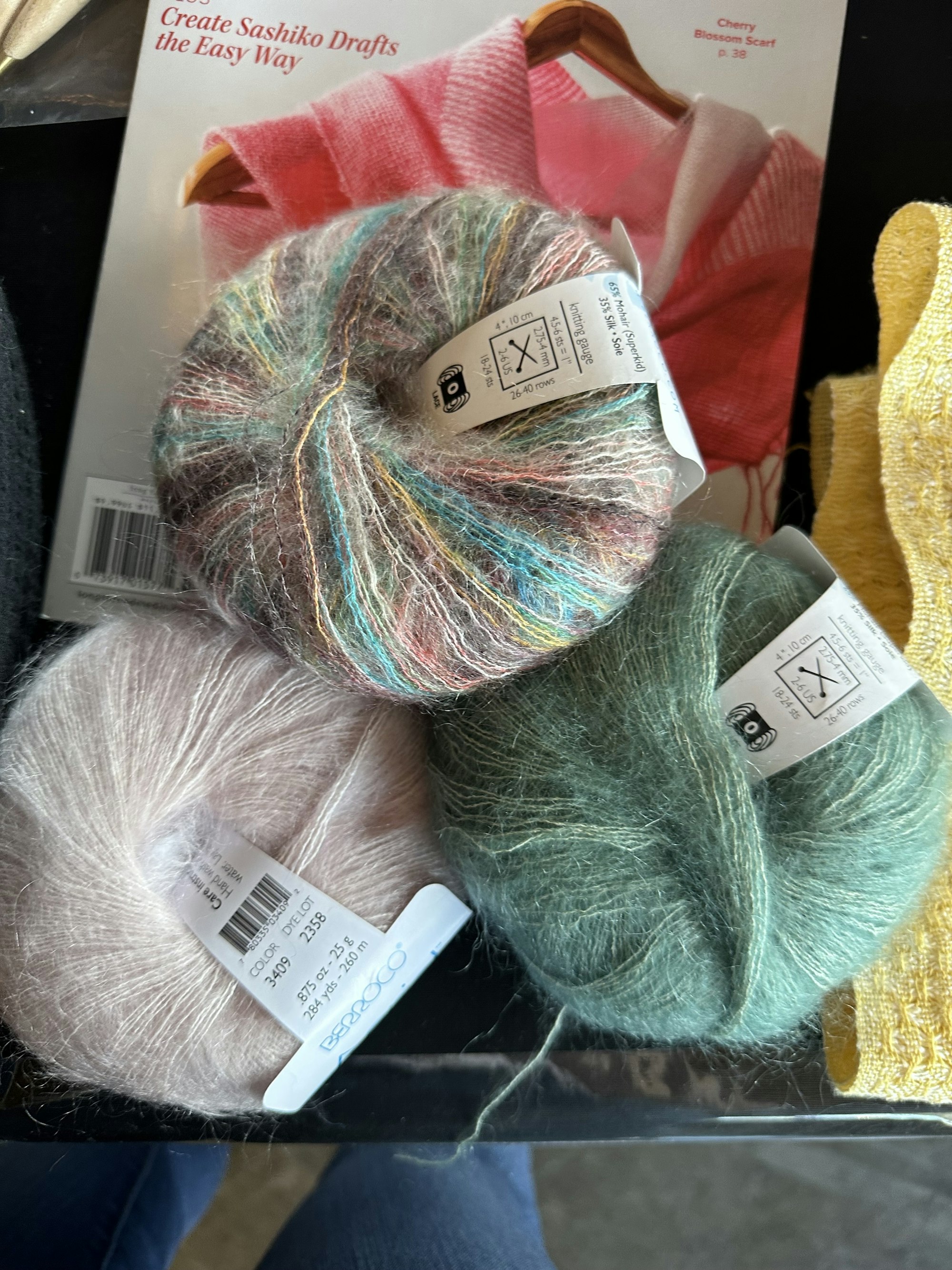
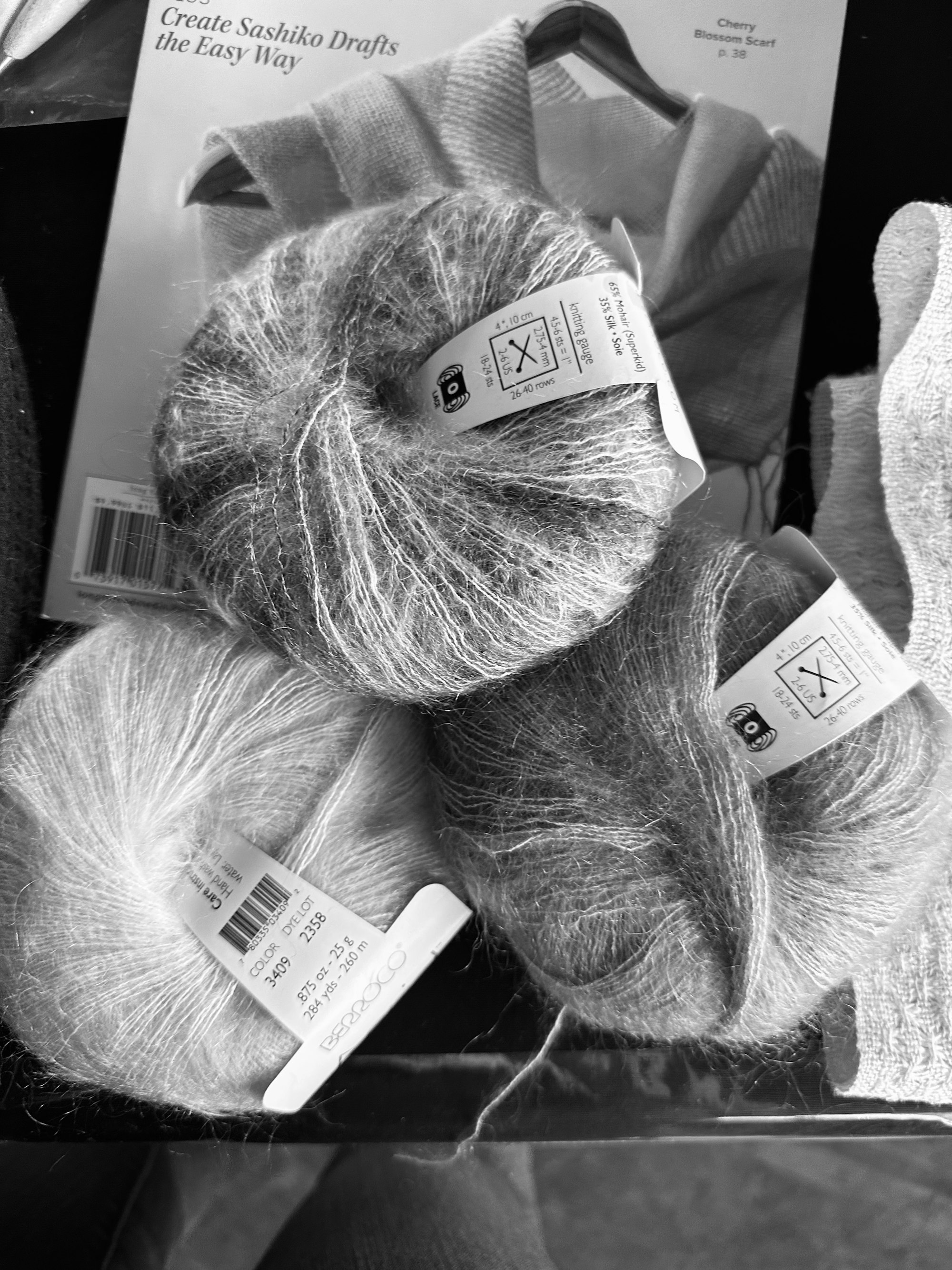
Snap a photo with your phone and turn it to black-and-white to see if your yarns have good contrast. Are you surprised to see that the teal yarn has the darkest value? Photos by Long Thread Media
Once you understand these two rules and a few others, choosing colors and weave structures to create gorgeous cloth becomes easier. Color in weaving is complex, but it doesn’t have to be confusing. You can design beautiful handwoven cloth in your choice of hues by learning the basic principles of color and how to apply them.