Boundweave is an entrancing structure. With a simple threading, you can create beautiful, weft-faced cloth perfect for cozy rugs, wall hangings, and many other household items in boundweave (on four shafts) or its close relative krokbragd (on three shafts). Lynn Schuster shares advice for designing with boundweave.–Handwoven editors
I began weaving boundweave rugs in 1993. I was inspired to head down that path by a project in Handwoven magazine that showed the most beautiful rug I had ever seen (Phyllis Waggonner’s Bound Rosepath Rug, right, from the May/June 1987 issue). It was threaded in a four-shaft rosepath, and had diamond and flame motifs surrounded by solid colors. Together, the colors and the patterns simply popped—this rug had so much life! I had no idea how it was woven, but I knew that I was going to figure it out.
I studied the article with enthusiasm, wonder, and some confusion. I was determined, so I decided to thread my loom and create my own draft according to the directions in the article. My first rug ended up looking very similar to the rug in the photograph. While creating the design for it, I could not fathom how it was going to come to life on the loom, but of course it did. Since then, I’ve woven many boundweave rugs and have learned so much along the way. I’m thrilled to be able to share some of my observations with you.
Color in Pattern
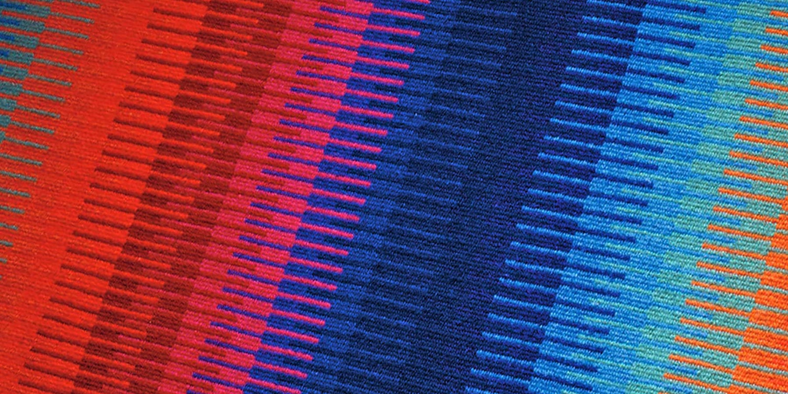
Boundweave is a weft-faced structure. Because the warp ends are sett so wide (I sett my rugs at 4 ends per inch), the weft packs down to fill in the spaces—covering the warp completely. There is no interaction of color between warp and weft, so weft colors appear exactly as they do when you’re looking at the skein or cone.
Boundweave can be woven on different types of threading. I use rosepath for my rugs, so I can weave flame and diamond motifs—but the weft colors must have some contrast in order for those motifs to show.
When I’m choosing colors for a project, I twist together single strands of all the shades I’m considering. That twisted grouping shows the relative values (degree of lightness or darkness) of the yarns as well as the amount of contrast between them. This information helps me create fabrics that have fewer surprises on the loom.
To show different motifs clearly, we need sufficient color contrast between them. The way to achieve that is wide open to the weaver’s imagination. Sometimes I contrast warm colors with cool ones, clear colors with muddy colors, or light colors with dark colors.
To blend separate design elements into a larger motif, we can use several colors with the same value. I've found that you can use any colors next to each other as long as they are of the same value. Having a consistent value level among several colors unites them into a group, which then can be treated as a single entity for design purposes.
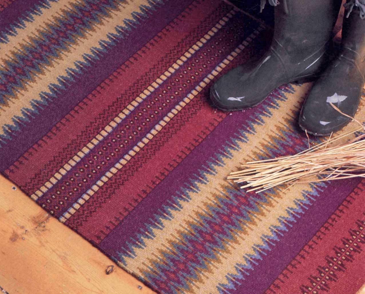
The Balance of Contrasts
Color contrasts must be kept in balance: Moments of solitude and moments of sociability. Moments of excitement and moments of peace. Too much of any of these is too much of a good thing.
Visual design is as important as color theory. Design elements also need to be in balance to maintain a sense of liveliness without the overstimulation of too much pattern—which can leave one with a feeling of confusion.
To showcase a color, I may use it sparingly and position it next to colors that contrast strongly. Size contrast can be introduced by unevenly dividing spaces. Set a wide pattern area alongside a narrow strip of solid color, or place a narrow strip of pattern in a wider field of solid color.
I find that the natural world is an excellent source for viewing color and pattern. The vertical lines of the trees in contrast with the horizontal line of the lake surface. The color contrast between water and trees. A sunny, bright day in contrast with a dark, ominous stormy day. Get creative and have fun!
Posted March 11, 2015; updated Nov. 10, 2017; updated Nov. 25, 2025.