Have you ever wondered why two yarns that looks great next to each other on the shelf combine to create a muddy mess? In her latest article from the March/April 2018 issue of Handwoven, Deb Essen explains how to learn from her mistake and (not) choose colors for shadow weave. —Christina
For months, I had a shadow-weave draft “seasoning” on my worktable with plans to weave up color samples for a new 2018 kit. For those who don’t know, shadow weave is a color-and-weave structure that is related to log cabin. Like log cabin, two colors of yarn are used in the warp, alternating dark/light, and the weft yarns also alternate dark/light (or light/dark for a change in pattern). The difference, in simplest terms, is that log cabin is a two-shaft plain weave, but shadow weave, which is also plain weave, is for multishaft looms. For shadow weave, the threading and treadlings create “shadow” outlines on separate sets of shafts based on the underlying weave structure. It works best with highly contrasting yarns so the patterns show clearly. It’s also a really fun weave structure and much easier to weave than it appears.
I decided to use 5/2 bamboo for warp and weft. As I sorted through my stash of bamboo, I selected several highly contrasting yarn combinations. The deep rust and aqua cones beckoned. Rust and aqua are complementary colors (opposite each other on the color wheel), and they were so pretty next to each other. Still, a little voice in my head said, “These two yarns are really close in value. It’s not going to work.” I did a twist test and the aqua popped against the rust. I held the gray scale against the cones and they looked really, really close in value. My little voice insisted, “It’s not going to work!” Even so, I was curious and decided it was worth a short sample.
Before I go further, let’s talk a little about color value in weaving. Color value is the depth or weight of the color of a yarn when compared to the gray scale. Color value is not color saturation. Color saturation is the amount of pure hue that is in the color. For example, a pastel baby blue yarn is created by adding white to the true blue hue, which is called a “tint.” Navy blue is created by adding black to the true blue hue and is called a “tone.” In value scale, the baby blue is closer in color value to the lighter end of the gray scale and the navy is closer to the darker end of the gray scale. That’s pretty easy. Where it gets complicated is when colors look very different but fall into the same area on the gray scale. (If this is confusing, I spend time on this in my video Color in Weaving that will help clear it up.)
Color value can work for or against you in weaving. When weaving plaids, using yarns that have color values that fall in the same value range is wonderful. The two yarns blend and create a new color that coordinates with your squares of true color where the warp and wefts of the same color intersect. However, with shadow weave or log cabin, the blending of the two colors can obscure, or even eliminate, the pattern.
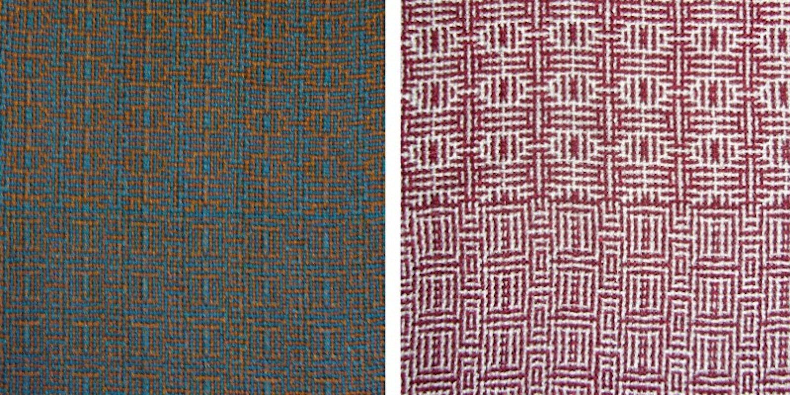
Back to my two yarns: I wound a short warp and uttered my first “hmmmmmm.” The yarns were really blending together. I dressed the loom, alternating dark (rust) and light (aqua) warp ends, and wove the first 2 inches, alternating the wefts. Uh-oh. (At this point, the little voice in my head gloated, “See, I told you!”) The pattern was completely lost in the interlacement of the two yarns. I finished the 12 inches allowed for the first pattern of dark (rust) and light (aqua) and then switched the color order to weaving with aqua first and then rust, which changes the pattern. Better, but not great, and the aqua now looked dark green. I wove the final 10 inches and washed the fabric. The second weaving pattern shows some contrast; the first weaving pattern is totally lost.
I decided to do a little trick for checking the color value of yarns. I took a digital photo of my two yarns and loaded it into my computer’s photo program. I converted the photo to gray scale and my answer was staring at me: the two yarns look exactly the same in black and white. They are the same color value. (The little voice in my head was laughing now.) You can do this with your smartphone using the black-and-white conversion filter. If your phone doesn’t already have the conversion app, there are free apps available to download. This trick is very convenient when you are standing in a store wondering which colors of yarn to buy! (Note to color knitters—this works great for knitting, too.)
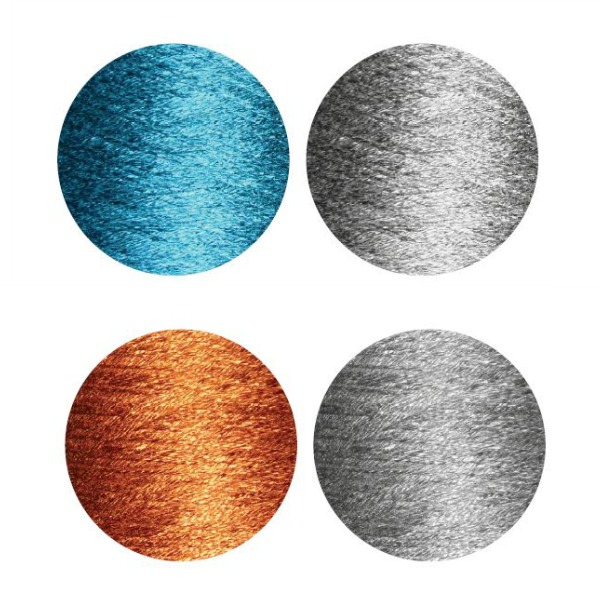
Deb’s yarns in full color and then after conversion to gray scale.
Obviously, the rust/aqua color combination will not be in a kit, but I am so glad I did the sample! Learning opportunities are always valuable, and the sample makes a great teaching tool and reference. Determining color values takes practice. To learn more about color values and how yarns interact with each other, you can always weave a color gamp. Select several yarns from your stash that are all the same size or fiber. Line them up by color value by comparing the colors to the gray scale. Then snap a picture and check your yarn lineup against the black-and-white photo. Rearrange the yarn order to match the photo if necessary. Wind a warp in 2- to 3-inch color sections in color value order from the heaviest value (the dark end of the gray scale) to the lightest value, then weave in the same color sequence in 2- to 3-inch squares. Watch what happens when the different colors interact. Now try the same experiment with a different size of yarn or fiber and compare the two samples. Mark your color gamps with the size and colors of yarn used and any other notes that will be helpful in the future. It’s great fun, and now you have a super reference tool for future projects. And of course, remember to listen to that little voice in your head!
—Deb Essen
Editor's note: Along with all these great resources, it can also be helpful to learn about shadow weave in a course. There are many great virtual and in-person options, including Introduction to Shadow Weave. In this online course, award-winning weaver and teacher Jannie Taylor introduces you to shadow weave and its dazzling patterns. She's ready to share her years of experience learning how to weave shadow weave and help you discover all its magical possibilities:
Both Deb's Color in Weaving course and Jannie's Introduction to Shadow Weave course are available to watch today at Learn.LongThreadMedia.com.