I love combining many colors in my weaving. Pearl cotton has the largest color selection of any yarn I can think of (excluding perhaps some wools, which, as a Southern Californian, I don’t generally use). I use pearl cottons frequently, and as a result, I have lots of bits of leftover yarn in quite an array of colors. Those little bits occasionally make me want to weave a stashbuster project to use up accumulated inventory. Many of my weaving projects require a lot of preplanning, so sometimes it’s refreshing to alternate those with something more freeform that allows me to be more spontaneous in my decision-making.
For this design, the only yarns that may need to be purchased are the white and the black ones (which are always useful to have on hand anyhow)—the rest of the colors can come from your stash. I used 5/2 pearl cotton for this throw and sett it at 21 ends per inch (1-2-2-2 per dent in a 12-dent reed). You could easily substitute 10/2 cotton or any other yarn you might have, adjusting the sett accordingly. If you want to really go off the grid, use a consistent grist in your warp but various yarn sizes in your weft—keeping in mind that your selvedges may get wonky if the differential is too great.
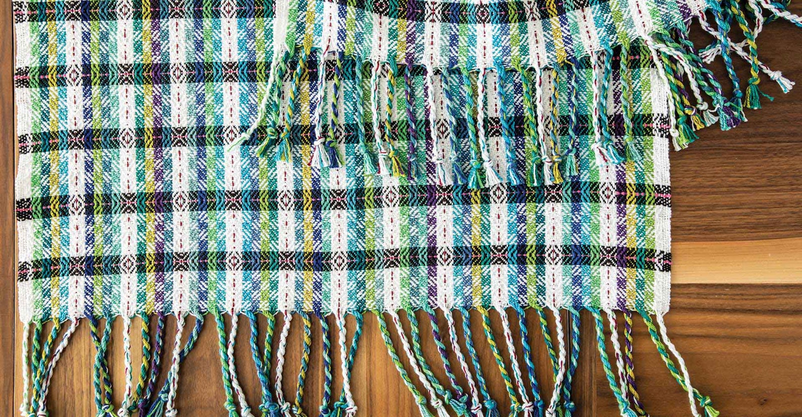
I originally wove this throw with colored threads in the warp, but it could just as easily be woven with black and white in the warp and the colors in the weft as shown in the drawdowns in on the next page. This gives unlimited flexibility in choosing colors as the weaving progresses. When I looked at the design’s drawdown using weaving software, it seemed to my eye that the white and black stripes appeared to have their own interwoven design much like intertwined ribbons, and I wanted to draw attention to them. The colors that you add to the black and white base of the design will determine how much visual emphasis is put on those high-contrast “ribbons.”
One color strategy is to use analogous colors, as I did in my throw. I chose colors close to each other on the color wheel going from green (UKI’s Pistachio) all the way to purple. By using colors so closely related, I created a peaceful color background that allows the chevron details and the black-white ribbon pattern to stand out. The colors I chose share some hues and blend easily together.
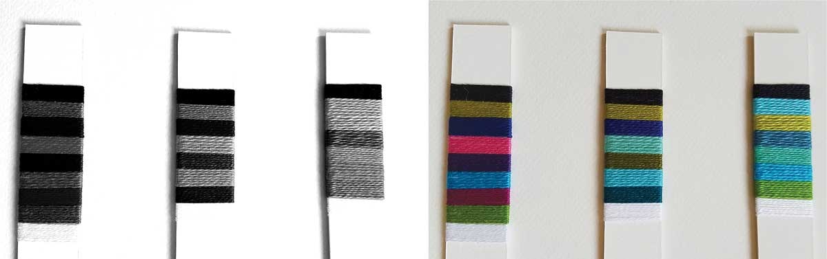
Black-and-white copies or photographs of colorful wraps allow you to see the values of the colors you are considering.
A different approach would be to use a mixture of high-contrast colors. In that case, you would pick colors that are far apart on the color wheel, also called complementary colors. That strategy would create more visual movement in the colored stripes, moving the attention to that area of the design and taking it away from the black and white ribbons. The drawdown on the right shows how a mixture of cool and warm colors might look in this same draft in a woven cloth. Note how the black and white ribbons recede in this drawdown. Consider also saturation of hue: bright, pure colors might yield a clean, contemporary look, while less saturated colors could give you a more traditional, subdued look.
Although it’s easy to get caught up in where the colors fall on the color wheel, their values must also be considered. Color value often contributes more to the success or failure of a design than the actual colors. The black and white ribbons in the draft contain the darkest and lightest values. With respect to the color wheel, yellow has the lightest color value and purple the darkest, but we rarely work with pure hues, instead we use colors with values that were altered through mixing. Think how different a sky blue is from a navy blue. Do you prefer your added weft colors to fall into a midvalue range as mine did, or do you want to include a wide range of value contrast for higher drama?
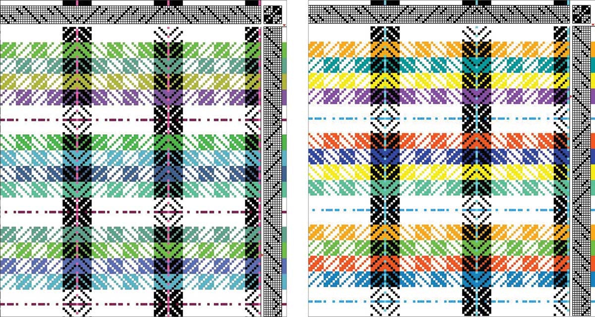
Above left: You may see the “ribbons” Deborah saw, but notice also the bright pops of pink that she added to the black and white stripes to prevent monotony in her color scheme. Above right: Using colors with higher contrast might create a more dramatic piece but could also diminish the appearance of the ribbons.
Sometimes seeing a color’s true value can be difficult. To help you be objective, use the trick of photographing or photocopying your colors in black and white to see their values. That will help you avoid being seduced and distracted by all the beautiful colors. With whatever approach you choose, weave with abandon using colors and color schemes you love.
DEBORAH HEYMAN lives in Irvine, California, and continues to find new things to learn about color and structure with the Weave Structures Study Group of the South Coast Weavers and Spinners Guild.