
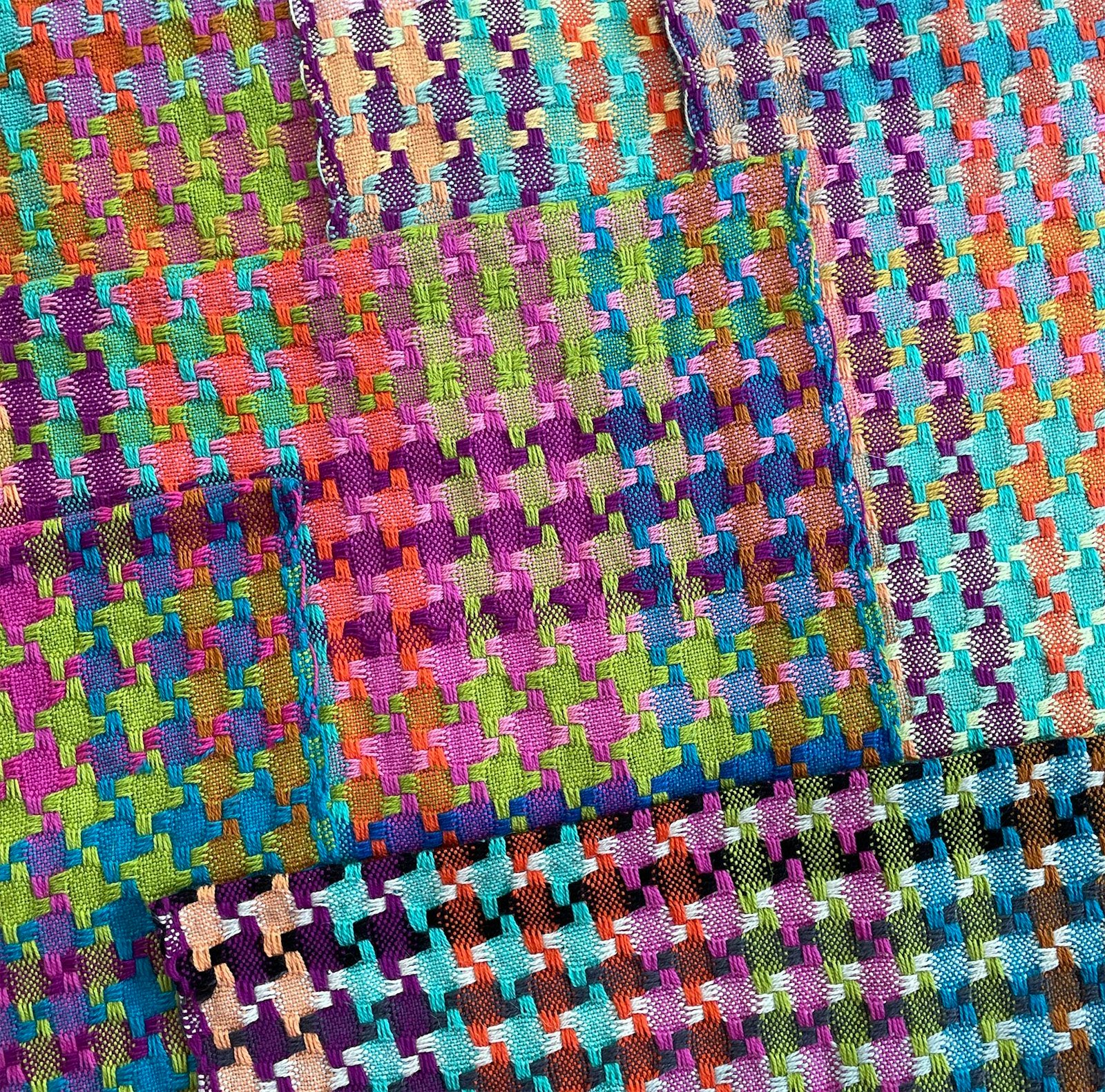
Welcome to “Five Questions,” where we get to know designers and their weaving a little better.
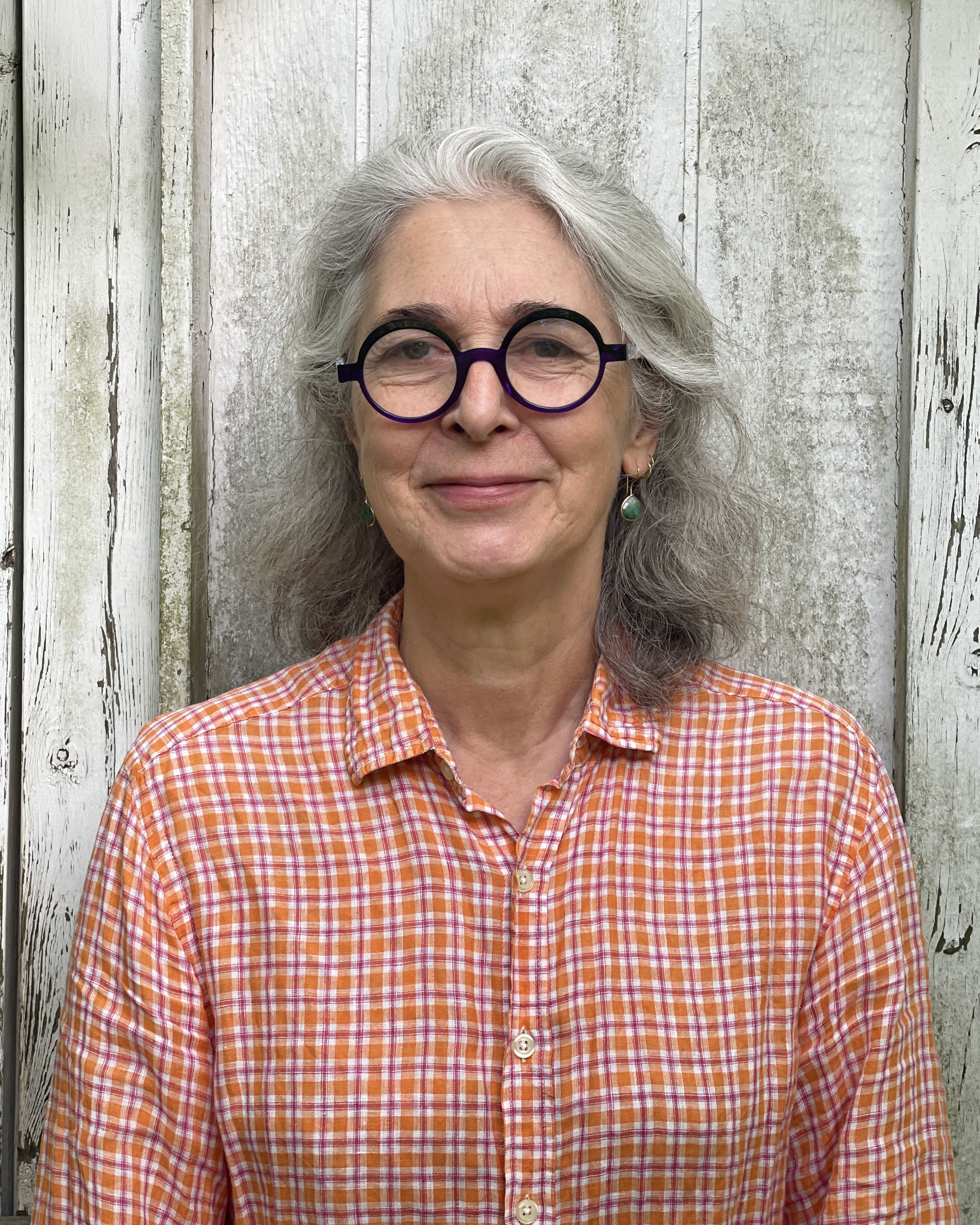 For this edition we’re talking with Véronique Perrot, the multi-shaft weaver, designer, and teacher who is simply brilliant with color. We’re thrilled that she’ll be joining us at our upcoming Weave Together with Handwoven retreat in beautiful York, Pennsylvania, March 21–25, 2027.
At the retreat, she’ll be teaching a three-day hands-on class about how to develop your own sense of color. Students will learn how to use their preferences to create a warp that’s their own color playground, they’ll study how different weft colors transform a piece, and they’ll leave with all of those samples plus a towel or napkin they’ve woven using their preferred weft options.
Read on to learn more about Véronique’s approach to handweaving and color.
Lynn: When and how did you start weaving seriously?
I got the weaving bug in my late teens, when I rigged a 4-shaft floor loom. What I’d built, I now know, was a sinking-shed, direct tie-up loom. I wove a few scarves on it, including one in 2/2 twill.
When that loom returned to the firewood pile I turned to knitting, but I never stopped looking at textile structures. I even started a wide-ranging textile library, with all the Peter Collingwood books, Madelyn van der Hoogt’s drafting book, and Carol Strickler’s eight-shaft pattern compendium, among others.
I started designing long before I started weaving again. During my serious knitting phase, I rarely followed patterns as written—I used different colors, retooled projects to use the yarns I already had, or designed projects from scratch.
Four decades later, in 2019, I returned to my first love when I landed Nestor, an 8-shaft Macomber loom and started weaving in earnest—at last! A lot of what I’d learned as a serious knitter translated into my weaving practice, somewhat to my surprise. Knitting is a lot of fun and interesting, but weaving has deeper and more numerous rabbit holes to explore.
When I turned back to weaving, I wove a few patterns by Elisabeth Hill more or less as written, but I soon moved to designing projects to use the yarns in my stash. I started collaborating with Elisabeth, and she suggested that I write up some of my projects into patterns to sell in her Etsy shop.
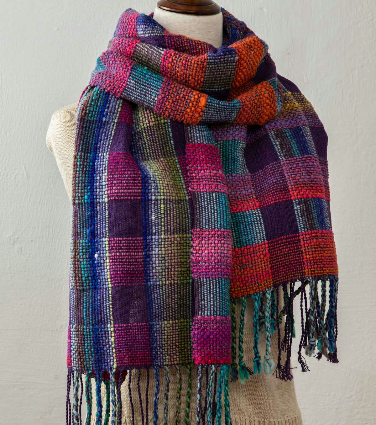
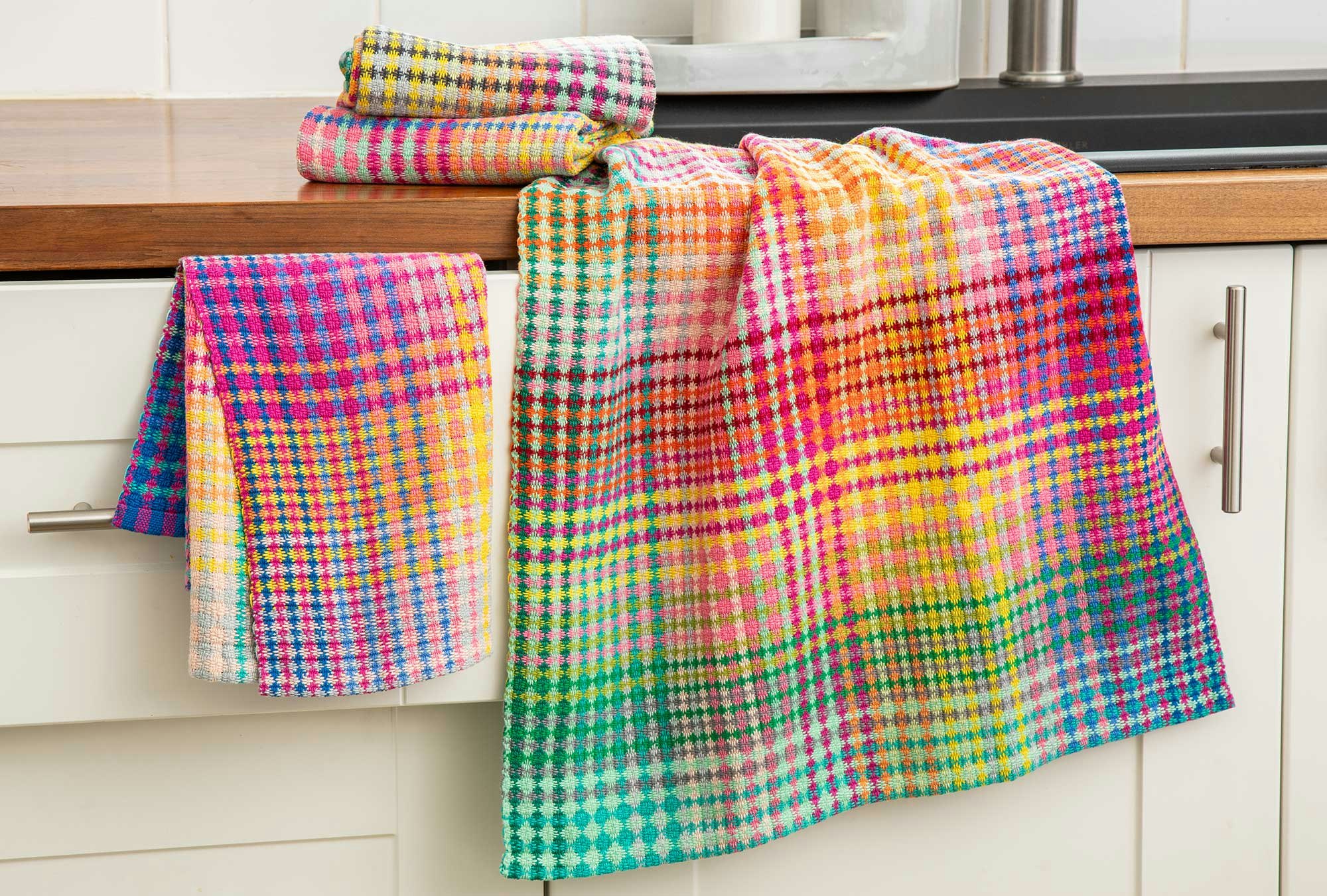
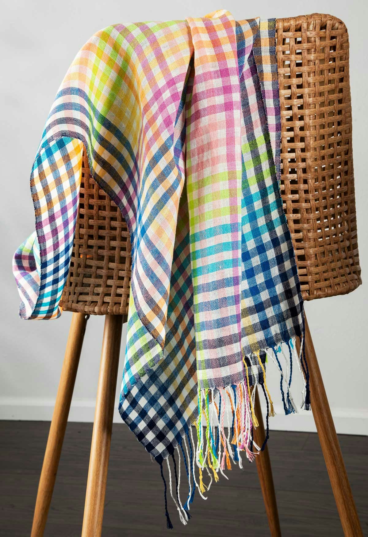
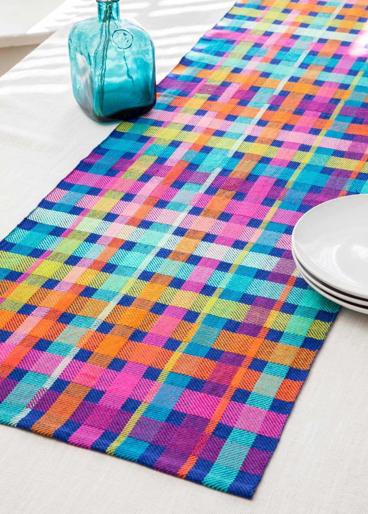
Photos by Matt Graves
L: How did you develop your sense of color?
My sense of color is probably a combination of inherent taste and personal history. I can’t say much about the former, except that I remember always liking bright colors.
For the latter, I have a few memories. My mother is an art historian who studies stained glass. I spent many hours as a kid in French gothic churches, the insides of which are bright and colorful when the sun shines through the stained glass.
From 6 to 16, I went to a weekly art class with an artist who had us work in various media as well as look at her vast collection of art books. I have a distinct memory of her pointing out how Kees van Dongen used green for the shadows in many of his portraits. This was an early exposure to Fauvism, which is still my favorite art movement. One thing I can’t remember that teacher ever talking about is the color wheel...
L: Your suggestion for fixing color problems seems counterintuitive. “If the five colors you picked don’t quite work together, add three more colors, then three more, and so on.” How did you come to this idea? Why do you think it works?
This idea comes from Bernard Turin, who was a French circus and plastic artist (1940–2008, active from the mid ’70s until his death). Among other things, he worked with crowds, such as using a crowd of people to draw the shadow of the Eiffel Tower. Turin said that there was no need to instruct people to dress in specific colors, as “there are no color mistakes in a crowd” (in the original French, “il n’y a pas de faute de couleur dans une foule”).
It’s the same principle as the delight we feel in a riot of colors or an alpine meadow in full bloom: lots and lots of colors, with no guiding principle beyond “the more the merrier.”
I can see two reasons why this works. First, with a more or less even split between many colors, no single color can take over the scheme. The load is shared between many shoulders.
Second, a color never exists alone (a precept I learned from my mother). How a color is perceived depends on the colors around it. My mom is not the only person saying this—the midcentury artist Josef Albers painted color studies and wrote his book Interaction of Color about this principle.
More colors lead to more possible interactions, and more chances to find pleasing relationships.
L: Have you designed and woven projects you love using primarily grays or neutrals?
I have dabbled with grays and neutrals. As usual, I am guided by the colors available in the yarn I’m using. For example, Lofty Fiber’s Euroflax linen has an especially rich collection of grays, in a range of values and hues (bluish grays, greenish grays, etc.). I just used this linen to weave a sample of double huck (two layers of huck lace), with bright colors on one side and various grays on the other. I really like the result, and I want to weave a project with this color scheme.
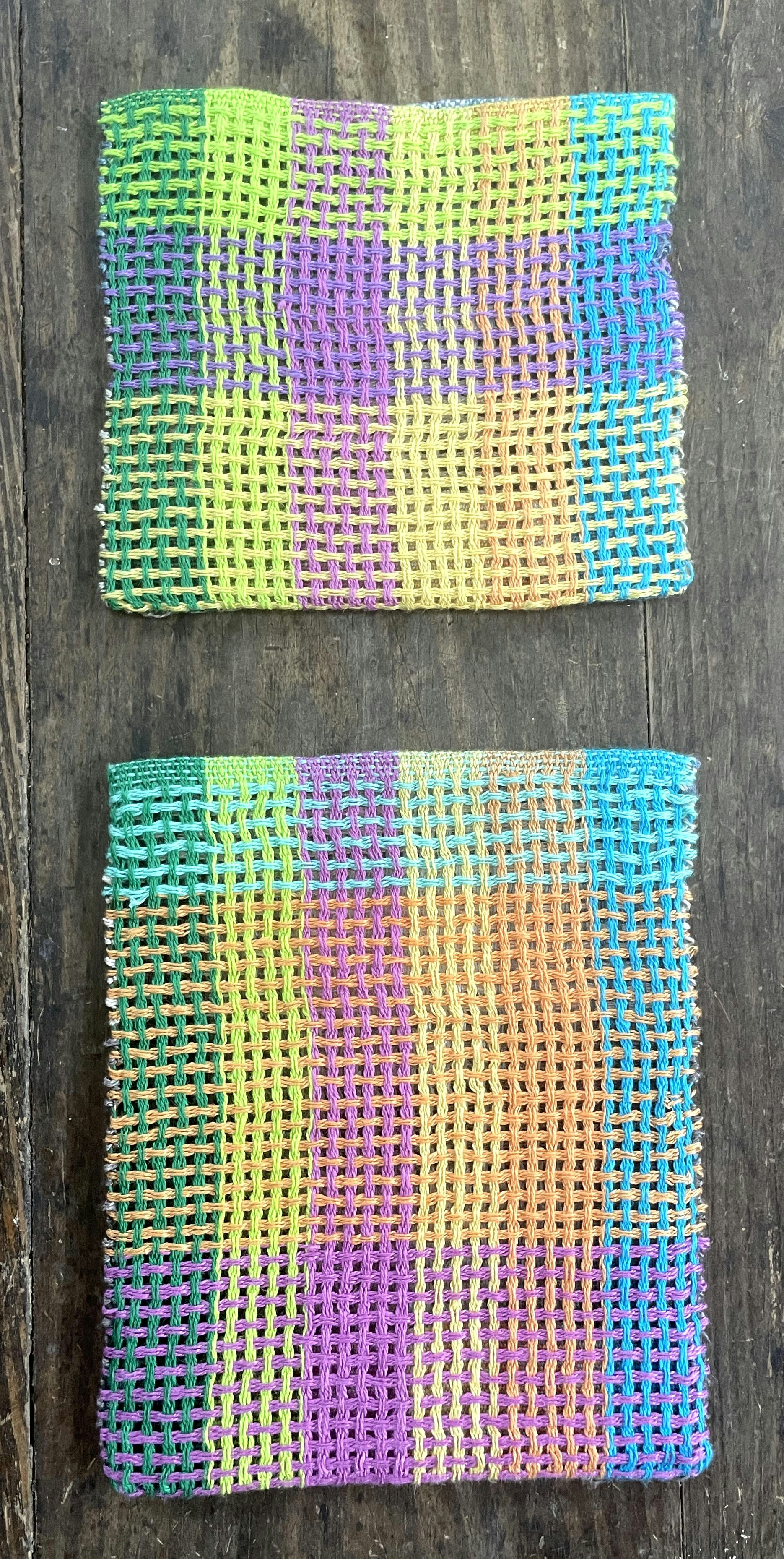
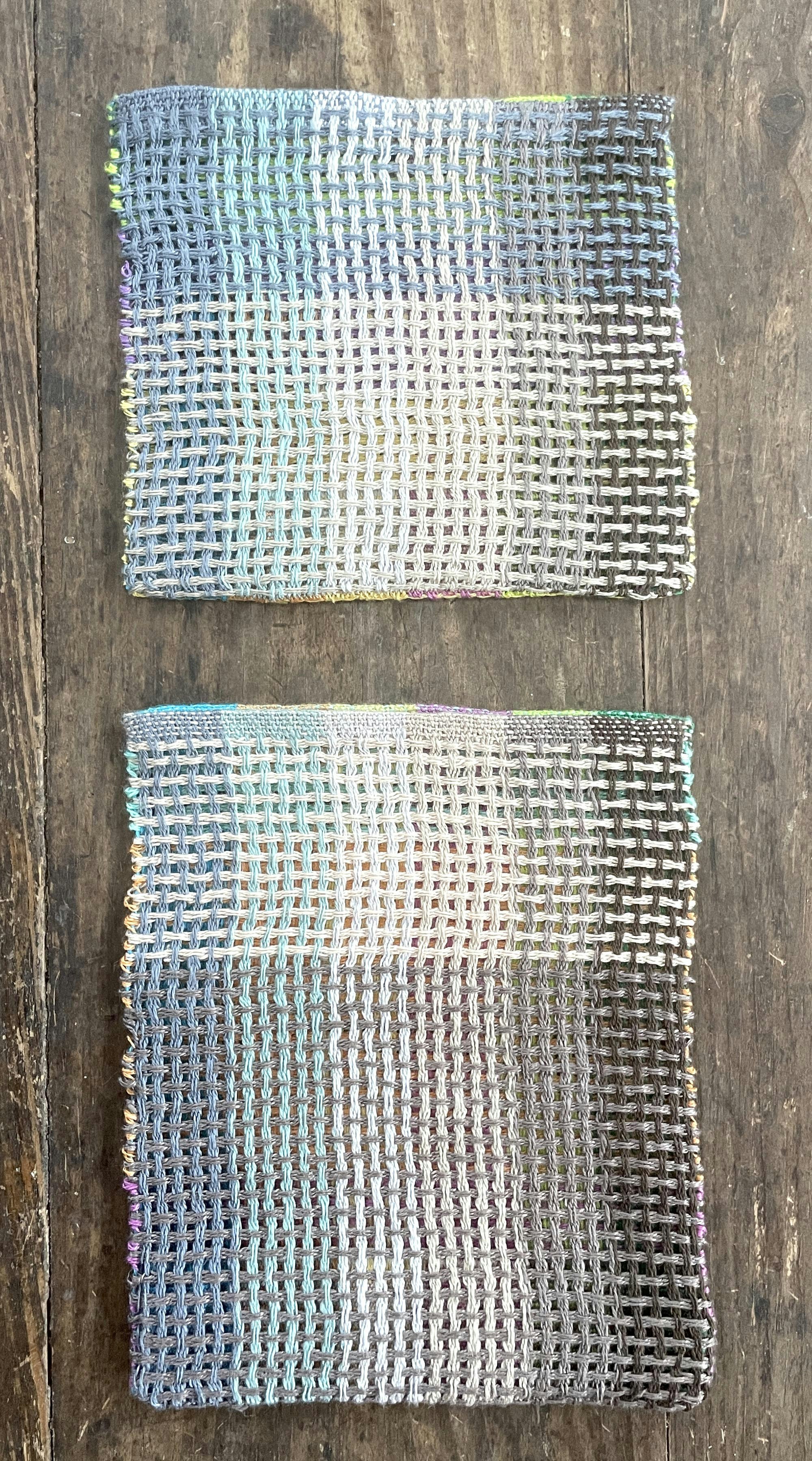
Click to enlarge. Double huck samples with bright colors on one side and various grays on the other. Photos by Véronique Perrot
When weaving towels in classic turned twill on 8 shafts with a colorful warp, I now systematically weave a couple of towels with weft in white, three levels of gray, and black (creating tints, tones, and shades of the warp colors). I first used these weft colors because I was in a hurry to finish off a warp, but realized that I really liked the result.
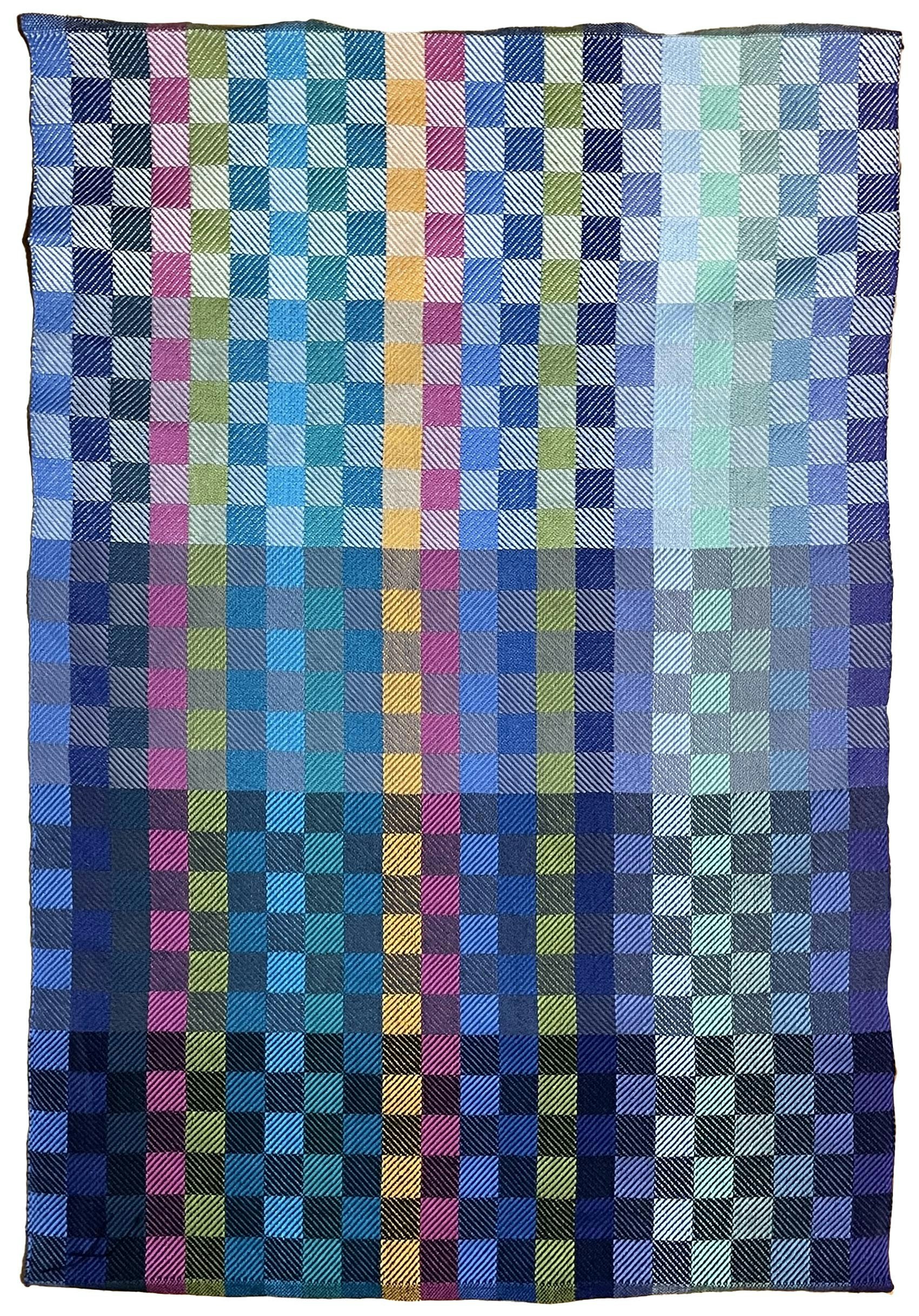
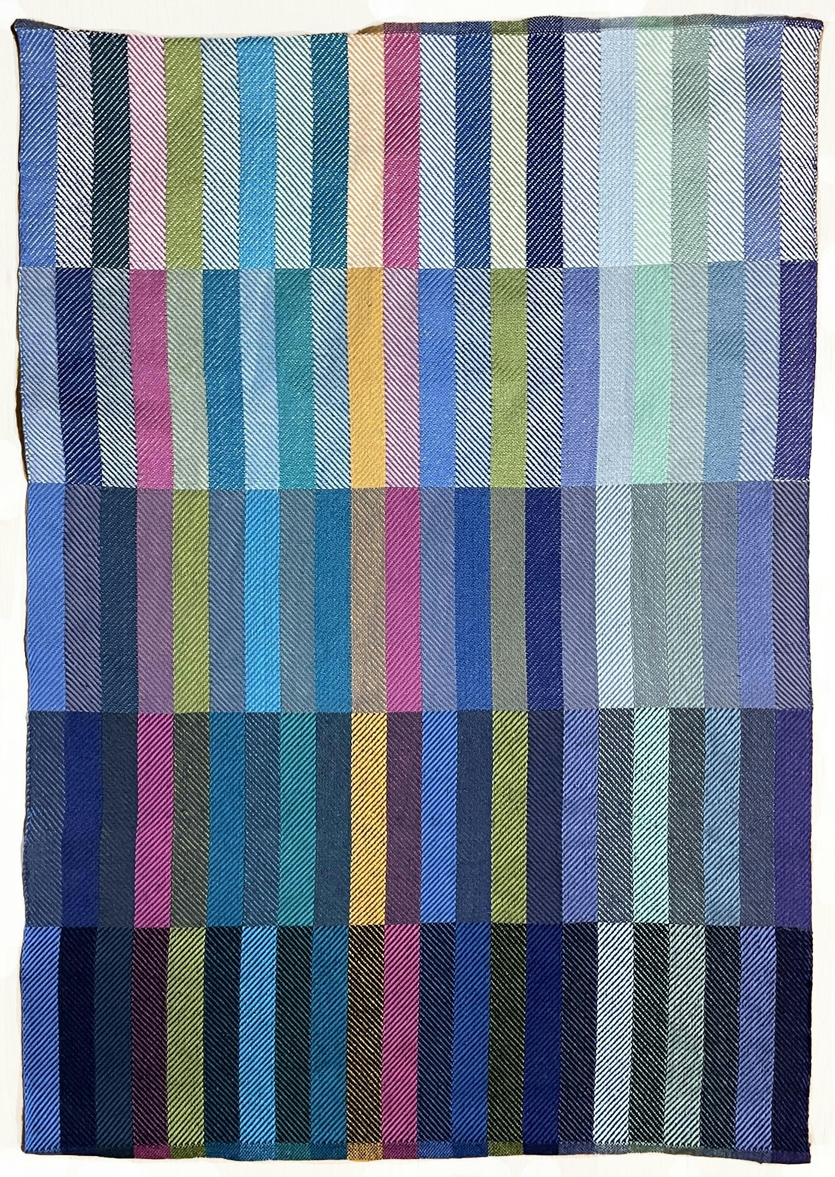
Turned-twill towels woven with wefts of white, three shades of gray, and black. Photos by Véronique Perrot
L: How do you adjust your advice for weavers who’d prefer to work with pastels or more neutral palletes?
In a project where warp and weft are evenly visible in the cloth, choosing the warp colors is half the design work. This is why, in my Weave Together 2027 workshop, weavers will design their own warp instead of weaving one of mine.
My preferred 8/2 cotton has plenty of bright colors, but it also has a beautiful range of pastels and toned-down colors. When weavers start with colors they enjoy, no matter how bright or subtle they are, I can help them come up with a final result they are happy with. My goal is always to help weavers find their own color voice.
It was such a delight to talk with Véronique about her approach to weaving and color. If you’d like to learn from her in person, don‘t delay—a few tickets are still available for our 2027 Weave Together with Handwoven retreat, but they‘re going fast!
Happy weaving!
Lynn
Make the Projects
Autumn Jewel Scarf, from the Fall 2024 issue
Color Nuggets Towels, from the Summer 2026 issue
Lighter Than Air Shawl, from the Spring 2025 issue, page 30.
Ribbons and Blocks Runner, from the Fall 2025 issue, page 50.