If you are interested in learning more about iridescence and how to weave fabrics that shift their colors in light, read this article by Bobbie Irwin from Handwoven September/October 2023. Want to know more? Bobbie is teaching a two-day class: "Shimmering Iridescent Scarves" at the Weave Together With Handwoven retreat. Learn from the expert... afterall, she wrote the book! After learning a few basics you'll weave two doubleweave cowls with shimmer and shine to further cement your new knowledge. Find out more about the weaving retreat by clicking here! - Susan
Add excitement to your weaving by including optical effects. Yarns such as Mylar create a sparkle of spectral colors, metallics (natural and synthetic) magnify light reflection, and some new yarns can even change colors or intensify in sunlight. In addition, there is woven iridescence, the effect that most interests me.
Back in 2002, one of my woven samples unexpectedly produced striking iridescence. Since then, I’ve been fascinated by the phenomenon. I wanted to know why iridescence happens and, more importantly, how to make it happen when I want it. More than two decades later, I’m beginning to appreciate the many variables involved and the vast number of amazing ways to make iridescent fabric.
Woven Iridescence Basics
At first, I concentrated on color relationships: complements, triads, tetrads, and the like—but I’ve simplified the requirements for seeing iridescence in fabrics. First, you need light. What we think of as iridescence is primarily the result of light reflecting off the valleys and ridges in our cloth, although sometimes it also incorporates light transmission in sheer and layered cloth. Movement helps us see shifting colors as we view the fabric from different angles. (I’ve mastered what I call “artful crumpling” for still photography and effective display.) The fabric must contain at least two colors or a yarn that reflects more than one color. Most importantly, you need visual contrast. This is commonly achieved through color variation, but iridescence can also be influenced by other factors including differences in luster and value; exaggerated textures, such as pleats; and even contrasting thread sizes within a fabric.

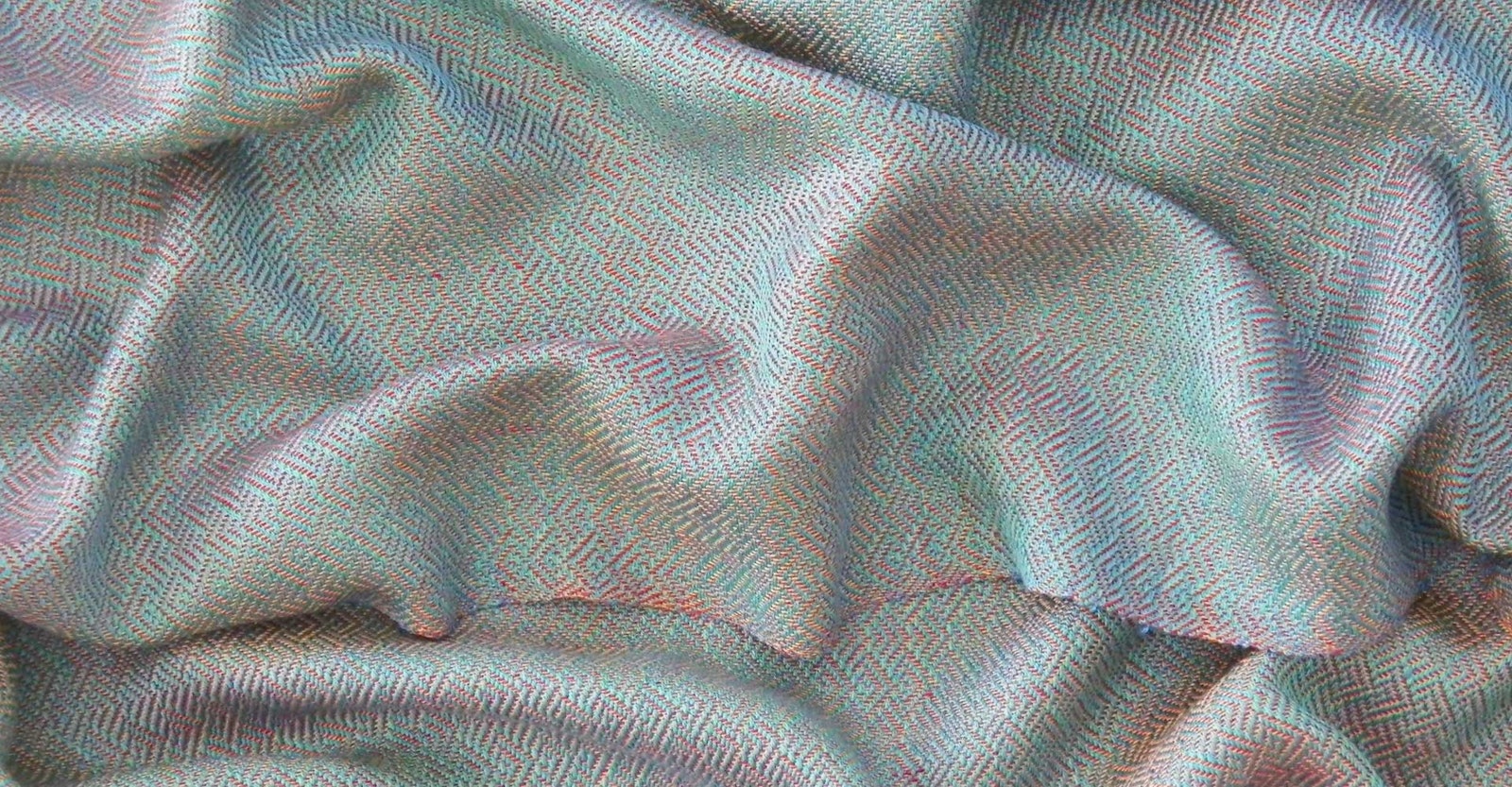
The space-dyed weft in this 20/2 rayon scarf ranges from green to blue, and the warp from red-violet to red and pink, with a touch of silver. The colors shift in constantly changing combinations. Bobbie sett this eight-shaft plaited twill scarf at 40 epi.
Two-Color Combinations and Color Mixing
I started my study by crossing two colors, the easiest way to produce the apparent color shift that defines traditional iridescence. Although my first samples were plain weave, I quickly discovered that floats increase light reflection and magnify the magic. We have endless possibilities working with two colors along with many different weave structures and fiber variables, including luster, value, and relative thread sizes!
Early on, I discovered that some of my favorite two-color combinations were the hues that fall between the pure primary colors on the color wheel. Hues such as blue-green and red-violet contribute their component colors to a woven mix and make it more interesting. It wasn’t long before I wanted to create iridescence with multiple colors, and for starters, I found ways to cross two yarns that would give the illusion of additional colors.
Some combinations of two colors give the effect of three through color mixing. Crossing red-violet with yellow adds orange to the mix while retaining the iridescence of the original combination. Blue and red give violet, and other combinations also mix visually. Crossing complementary colors (opposite on a color wheel), such as red and green of similar value, can give a brown cast to the fabric, which may not be what you’re after. Avocado green crossed with blue-violet can make gray. I call these bonus effects “sophisticated,” because you aren’t actually weaving with all the colors you see. This phenomenon is most apparent a few feet away and when viewed at a low angle. Color mixing works best in balanced plain weave, one of the few instances when I prefer that structure for iridescence.
You can expand the two-yarn color range by crossing space-dyed yarn with a contrasting solid or by crossing two space-dyed yarns. This works best with relatively short color segments and yarns from distinct color families rather than those with a wide range of colors.

At a low angle, this four-color scarf in Bronson lace looks pink on one side and blue on the other, although every intersection has the same four colors. Bobbie wove this scarf using 30/2 silk sett at 36 epi.
Color Orientation
Color orientation can dampen or enhance iridescence in otherwise identical fabrics. My early samples with turquoise warp and red weft worked well. In similar samples with red warp and turquoise weft, the red dominated, and the iridescence was subdued. Orientation can make an even more significant difference with more colors involved or with warp- or weft-dominant structures. The greater the number of colors you use, the more combinations there are to try; some will work better than others. It’s a good idea to weave a gamp to sample color combinations and orientations. Sampling different color orientations with an inexpensive yarn, such as 10/2 pearl cotton, is prudent, especially if you are planning a project with more expensive or finer yarns.
Three-Color Iridescence
I learned about the old French method of creating three-color iridescence in fine silk. These half-basketweave fabrics had a warp of one color and two weft colors used together in the sheds. The doubled wefts were not allowed to cross, and the weft order remained the same in each pick.
Could I alternate two colors in the warp and weave with a single shuttle? What isn’t practical with very fine threads on factory looms becomes workable on handlooms with heavier threads. I paired warp colors on the same shafts but in separate heddles, and sampling determined that those pairs could not share dents in a reed or they would twist. The only possible sley order is one per dent or two per dent, keeping the paired warps separated in adjacent dents.
This became one of my favorite games. With two warp colors, I can use up to three additional weft colors before floats become too long (so much for the idea of using one shuttle!). These fabrics are most magical with fine threads, when thread intersections are almost imperceptible, which encouraged me to use much finer threads and closer setts than ever before. Containing all the component colors at every thread intersection, every part of the fabric is iridescent. My first experiments with my modification of the French technique were in plain weave, but I found that structures with floats that better reflect light produce even more excitement. The denting restrictions can make it challenging to find yarns to double-sley at appropriate setts for the reeds you have and the structure you want to use, but I’ve had success with heavier 8/2 Tencel at 24 ends per inch (epi).

The wefts of these 8/2 Tencel scarves with parallel threadings on eight shafts produce iridescence with the two warp colors.
Parallel Threadings
Many weavers are entranced with “echo” patterns using different colors on parallel threadings. (The term echo was introduced in the 1930s for a different woven color effect. See Note on Echo.) Often with intricate curved patterns, many of these fabrics have little or no color shifting, although the multicolor effect is similar to some static patterns in natural iridescence. Using contrasting weft color (or colors) adds traditional color shifting.
So little time, so many possibilities to explore! Although my research is winding down, a new temptation comes along every so often. A recent workshop with Susan Wilson on polychrome crackle induced me to experiment with iridescence in yet a new way.
Note on echo
According to Helene Bress (The Weaving Book, 1981), the term echo was introduced by Bertha Needham for a color effect in twill-based structures, using two pattern yarns. It is most effective with closely related colors, especially lighter and darker versions of the same hue. Bress’s book shows echo variations for huck, monk’s belt, overshot, and other twill treadlings.
Resources
- Bress, Helene. The Weaving Book. New York: Charles Scribner’s Sons, 1981.
- Irwin, Bobbie. Weaving Iridescence: Color Play for the Handweaver. Lanham, MD: Stackpole, 2017.