 | |
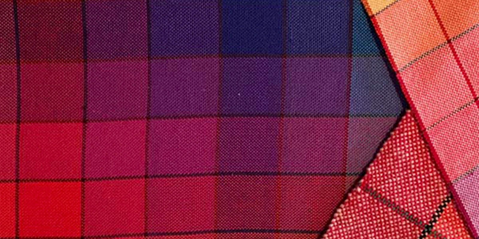
| The same red-violet appears warmer or cooler depending on the color around it. |
I love color. I love bright colors, dull colors, neutrals, jewel tones and everything in between. There are very few colors I dislike, and oh, so many I love. Combining colors is like alchemy, with some combinations bringing out the best in each other and others bringing out the worst. One of my favorite color pairings is bright pink and olive green—it sounds awful in theory but in practice it’s stunning.
Some people have what I like to call an artist’s eye for color. These are the people that seem to instinctively know what colors look best together and in what proportions They’re unafraid to combine colors that I’d be scared to use alone—and it always looks FABULOUS.
Knowing how to use color in weaving is very important, and this is something I think about every time I see a color gamp. The way the warp and weft threads transform throughout the weaving is almost like magic. Unfortunately I was not blessed with an artist’s eye for color and I’ve had many color disasters, through which I’ve learned valuable lessons the hard way about what not to do.
Fortunately for me—and anyone else who’s less than confident about their ability to choose colors—you can learn how to choose beautiful and interesting color combinations. Once you understand the basics of hue, value, and saturation, and know how to use a color wheel, everything becomes so clear.
It reminds me of when I was first starting to cook without recipes. I had what seemed like a million herbs and spices and no idea how to use most of them. Now I can taste something and know instinctively what to add to brighten the flavor or add some depth, and I’m learning to be the same way with color.
 | |
| Learning to use a color wheel is an easy way to increase your color confidence. |
Right now I’m addicted to Deb Menz’s book ColorWorks. It’s a fabulous resource that explains everything you’ve ever wanted to know about how color works. Most importantly for me, it includes a handy punch-out color wheel and templates to place over it, so choosing a pallet is a snap. It’s almost like magic the way she has you combine colors to make one brighter or to increase dramatic effect. I'm also obsessed with A Fiber Artist's Guide to Color —the way Laura Bryant teaches you to organize your stash is life-changing information.
I’m also very excited about Handwoven’s May/June 2013 issue which is all about exploring color in weaving. If you have any projects ideas for our color issue or any color questions you’ve always wanted answered, send us an email!
Until then, I hope you all have a very happy—and colorful—new year!


