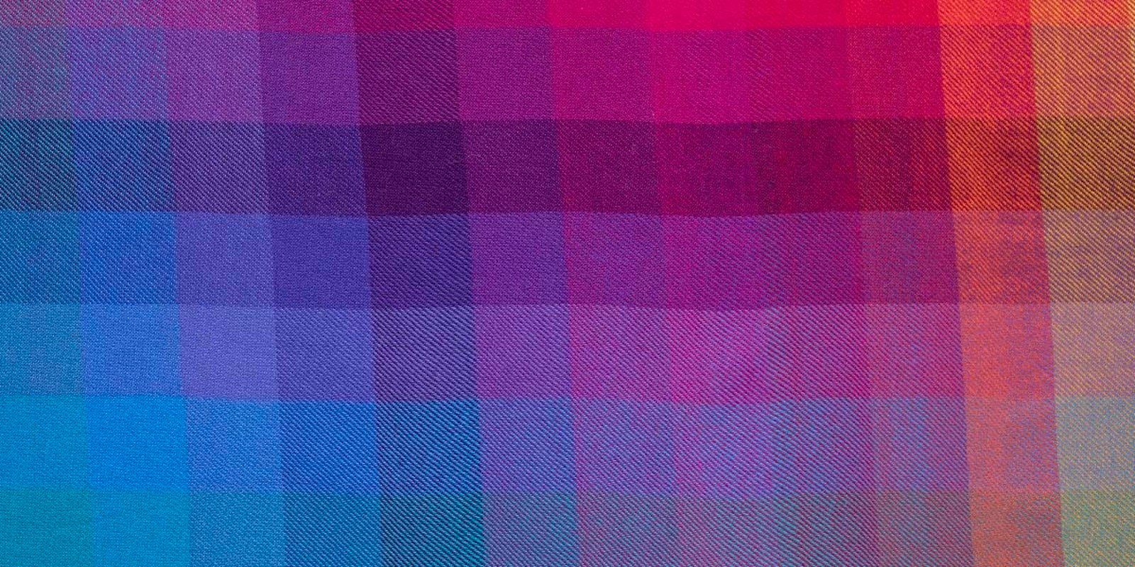
By now many of you have taken Madelyn's weaver's personality survey, and the last I checked, the color/texture people and the TBDs had a solid lead over structure/pattern folk. So maybe it's time for a bit of self-study about color in weaving. Color gamps are an interesting way to see how yarn colors interact, but materials and weave structures also influence our color perceptions. Colors in a fuzzy yarn may not appear as bright as the same colors in a shiny one. And according to the book Color and Fiber (Schiffer Publishing, Ltd., 1986) "Special types of weaving and embroidery depend for their effect on light reflectance that is created by fiber orientation as well as fiber length. Satin, sateen, and damask fabrics. . . use the longer float as their light-catching element. Not only do floats in weaving. . . catch more light than the smaller, more broken textured and interlacing stitches, the direction in which they are arranged makes a great difference in the reflectance and apparent value< of the fabric."
So there you go. If you want glam, go for long shiny floats. And for some fun while you're getting your glam on, you can try this color IQ test link tweeted by HGA. Warning: this is tough! But if you came out undecided on the weaver's personality survey, this will really sort out the color prodigies from the rest of us.