
The color of the year for 2022 was finally announced, and we're already thinking of so many uses. This color is meant to inspire creativity and reinvention and reflect the great transition so many are experiencing—a color that echoes the dynamic merging of our physical and digital worlds, courageousness, and how and where we use our energies in life.
Fellow weavers, meet Very Peri.
“The Pantone Color of the Year reflects what is taking place in our global culture, expressing what people are looking for that color can hope to answer.” said Laurie Pressman, Vice President of the Pantone Color Institute, in the announcement post. ¹
As weavers, we've had a conversation or two (or twenty) about color. We've looked at color theory in design and how seasonal trending colors can inspire new combinations. Though what is particularly unique about the 2022 color is... it's brand new.
“Creating a new color for the first time in the history of our PANTONE Color of the Year educational color program reflects the global innovation and transformation taking place. As society continues to recognize color as a critical form of communication, and a way to express and affect ideas and emotions and engage and connect, the complexity of this new red violet infused blue hue highlights the expansive possibilities that lay before us”. ¹
If you have explored the world of dyeing, you know there is an endless rainbow of color to be discovered, and there is something extra special about a brand-new color gracing our palettes for next year. Though not precisely Very Peri, we love these beautiful projects from our past pages to inspire ways to weave with this new hue.
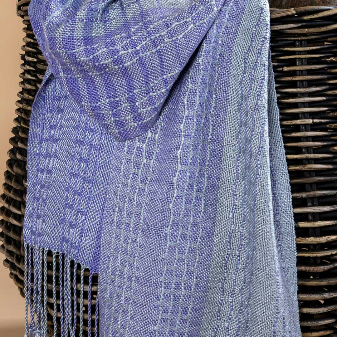
Wandering Paths by Susan E. Horton showcases a color like Very Peri in a very intriguing scarf. From Handwoven November/December 2020. Photo by Matt Graves.
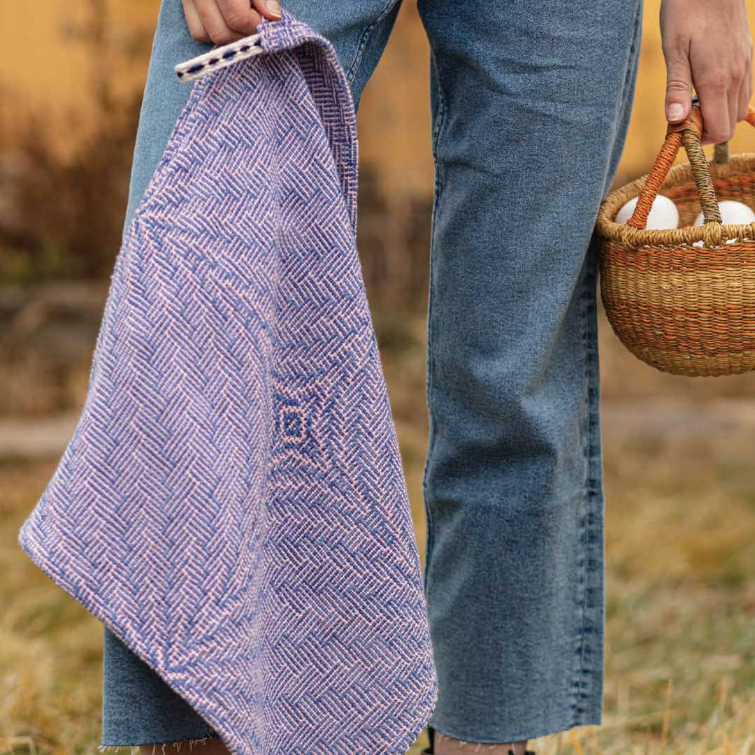
Blossoms and Butterflies Towels by Barbara Goudsmit is colorful and interesting, and would make a great project for Very Peri. From Handwoven March/April 2020. Photo by George Boe.
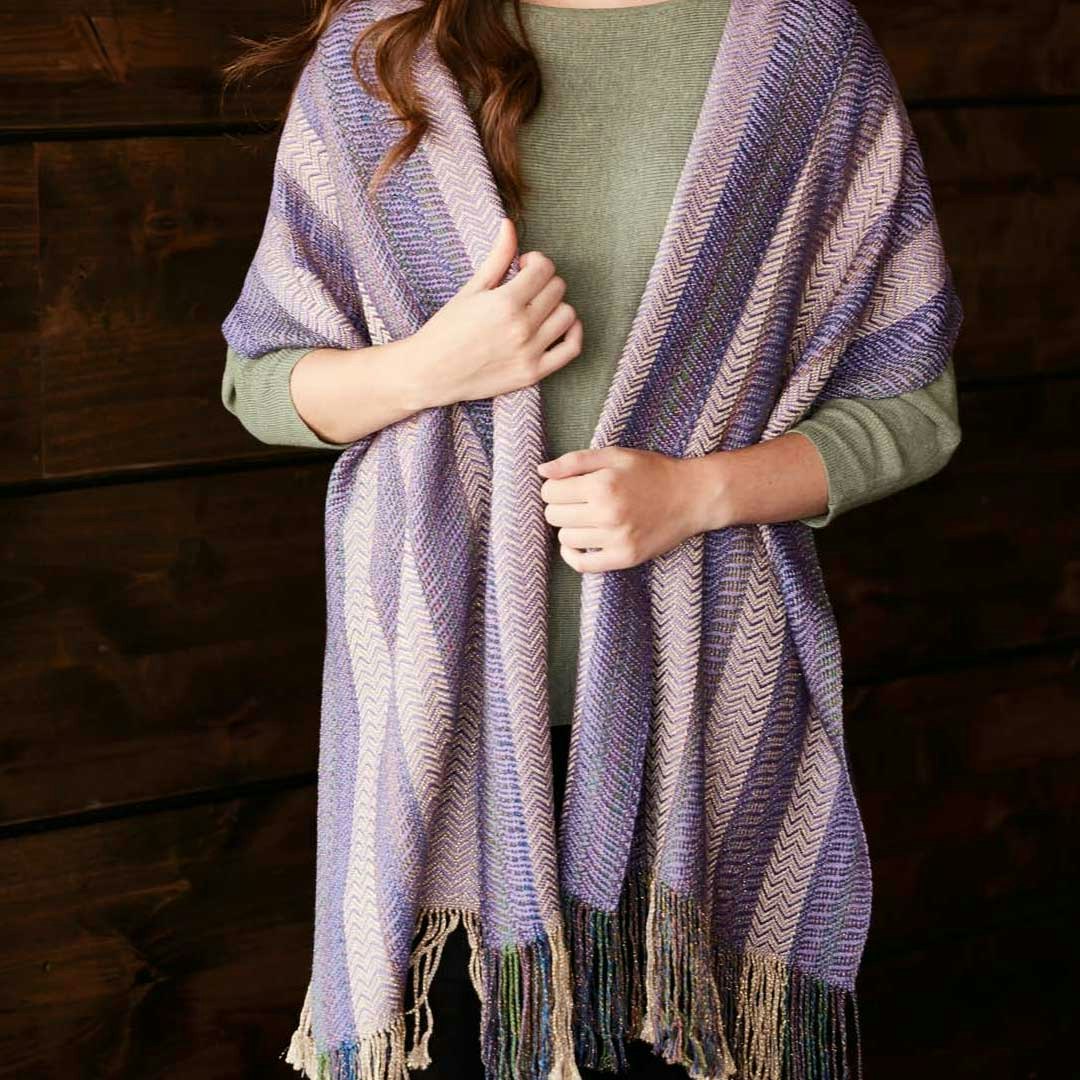
The Fusion Sparkle Shawl by Nancy Dunlap is a great stashbuster project and makes our purple-loving hearts happy. From Handwoven January/February 2019. Photo by George Boe.
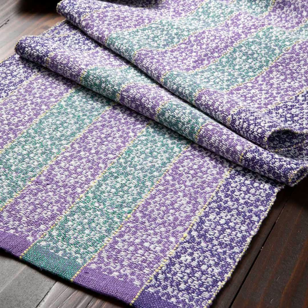
The overshot Circle of Life Table Runner by Deb Essen is a fitting example of using Very Peri with a complementary palette of colors. From Handwoven January/February 2021. Photo by Matt Graves.
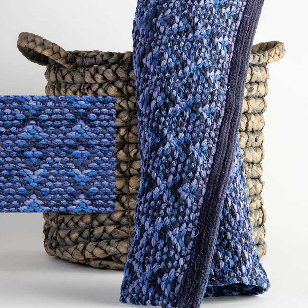
In An Epiphany of Ellipses by Debra K. Sharpee, a color similar to Very Peri joins with other colors to create the mysterious and elegant rug. From Handwoven September/October 2020. Photo by Matt Graves.
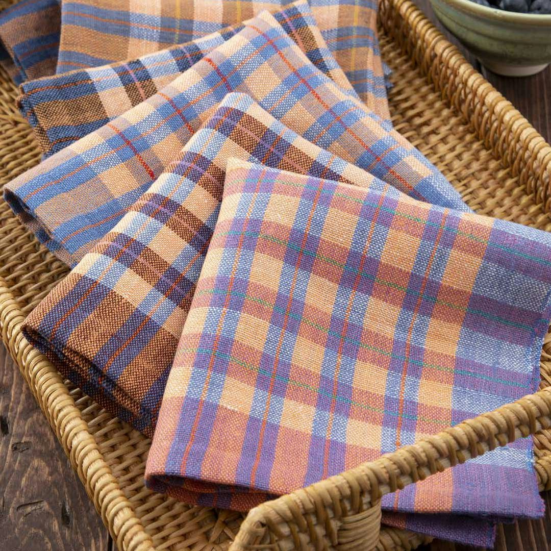
Projects such as Luncheon Napkins by Kira Keck offer an array of opportunities to add Very Peri with a plaid twist. Handwoven May/June 2021. Photo by Matt Graves.
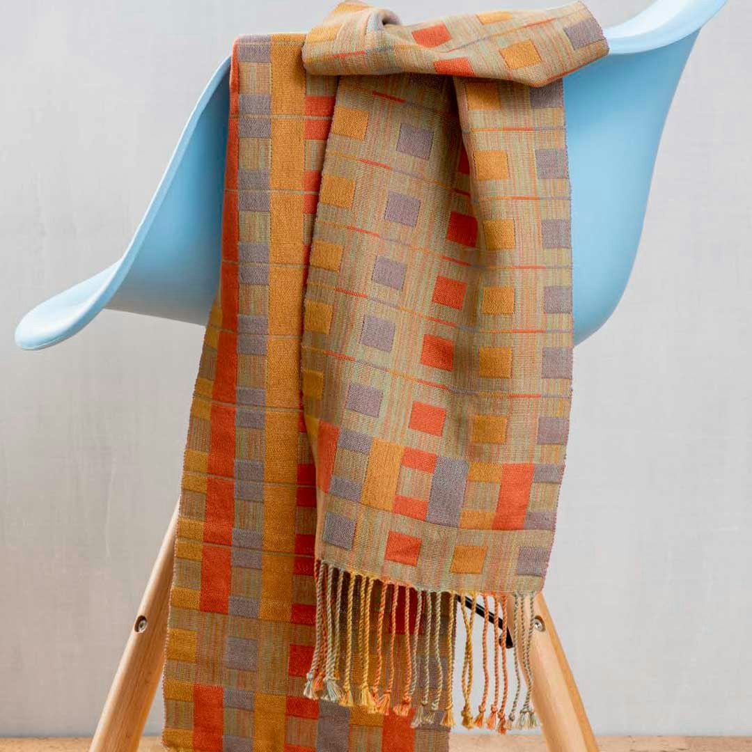
Doubleweave Designs by Sarah Fortin is a beautiful example of incorporating blocks of Very Peri(ish) colors in a scarf. From Handwoven March/April 2021. Photo by Matt Graves.
Resources
- 2021, December. Pantone Color of the Year 2022 / Introduction. Pantone. https://www.pantone.com/color-of-the-year-2022.
Projects Shown
- Wandering Paths by Susan E. Horton from Handwoven November/December 2020.
- Blossoms and Butterflies Towels by Barbara Goudsmit Handwoven March/April 2020.
- Fusion Sparkle Shawl by Nancy Dunlap from Handwoven January/February 2019.
- Circle of Life Table Runner by Deb Essen from Handwoven January/February 2021.
- An Epiphany of Ellipses by Debra K. Sharpee from Handwoven September/October 2020.
- Luncheon Napkins by Kira Keck from Handwoven May/June 2021.
- Doubleweave Designs by Sarah Fortin from Handwoven March/April 2021.