It might have been a dietary deficiency, or it might have been a nervous tic. When I was around six years old and starting to read voraciously, anything I could get my hands on, I also started eating the top right corner off the pages as I turned them. Just tore off a tiny bit and chewed it up and ate it. Is that strange? I remember that the cheap wood-pulp paper of Readers’ Digest was most satisfying. Slick, coated paper, not so much.
In the early years of Interweave, I tended to go overboard on paper quality. No sensible publishing professional would have made the choices I did: 70# stock for the interior of the magazines, #100 pound stock for the covers. This was for magazines that started out costing readers around $16 per year. Just for context, if 500 sheets of paper that are 25 inches by 38 inches weigh 70 pounds, that would be 70# stock. Heavy! My decisions were emotional, not rational, though. I thought that the paper should be as beautiful and feel as wonderful as the textiles we were printing on it.
Over the years, our paper decisions became more financially prudent. Then with new owners and shareholders, they became largely profit-driven. It’s amazing how thin a big sheet of paper can be and still be run through a printing press without falling to pieces. It became a bitter game among editors to see how many pages they could hold up to the light and see through at one time.

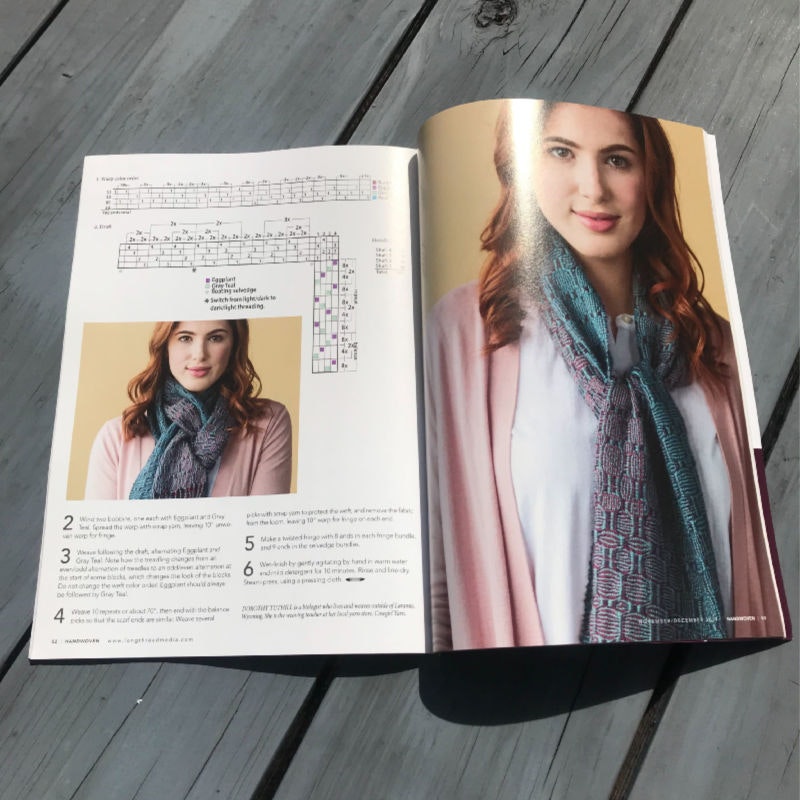
The new and improved Handwoven: now with paper you can't see through. Photo Credit: Rachel Szado
One of many new satisfactions of having control of SpinOff, Handwoven, and PieceWork once again is being able to let aesthetics and core values play into paper decisions. If you’ve already received your subscriber issue, you’ll notice immediately. Text paper jumped from 32# to 60#, cover stock from 60# to 100#, and glory be, an actual spine. Yes, it’s costly and yes, we’re on a shoestring. But we hope you will understand this change as a statement of what we value. If you share this value, we hope you’ll subscribe.
—Linda Ligon

