Handwoven contributor Elisabeth Hill is weaving a napkin project for Handwoven November/December 2018, and she is writing a 5-part series about the experience. Here is her second post about her weaving and design process and how she recovered from her first “huck horror”. Enjoy, Susan
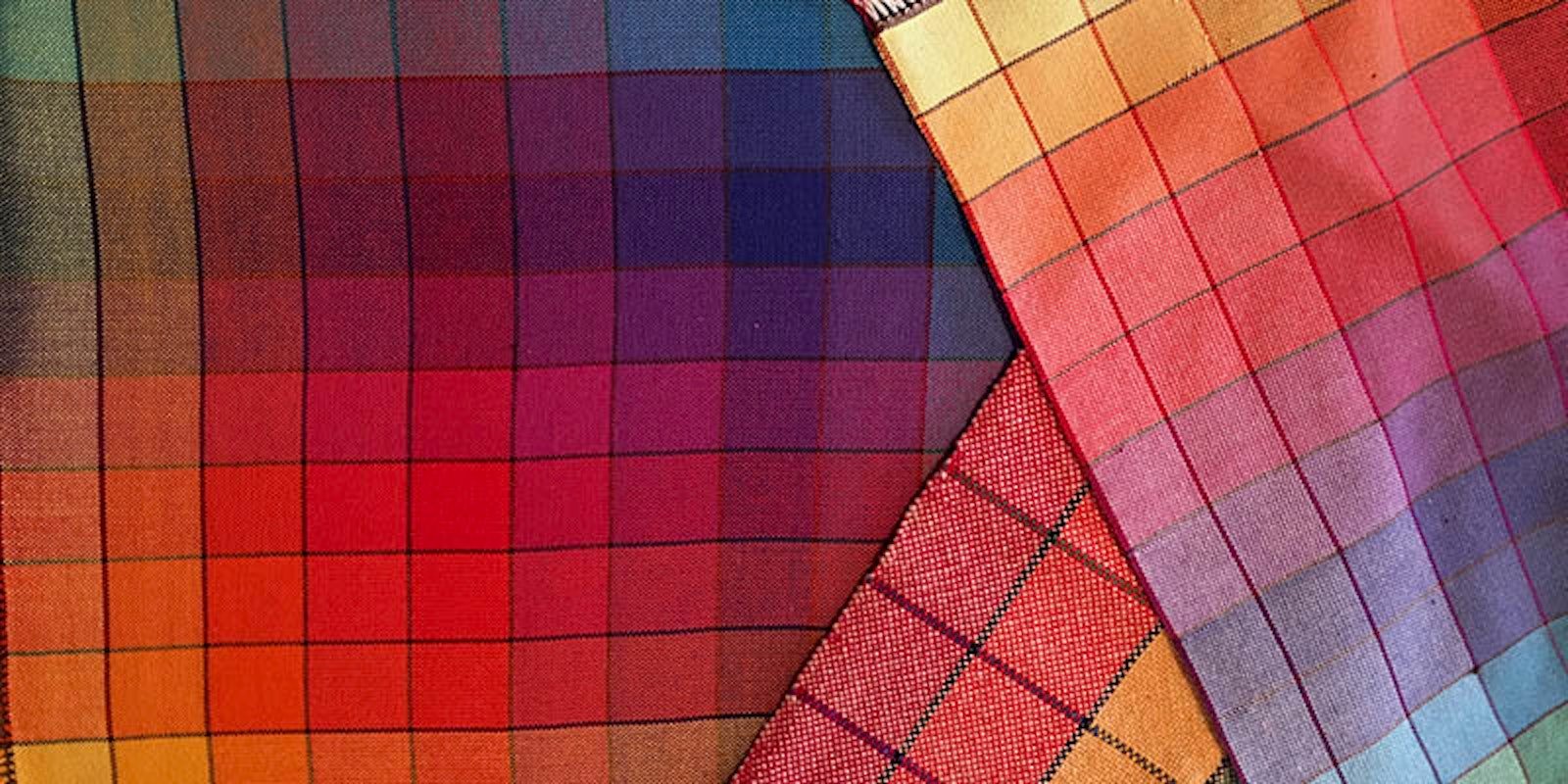
After the dismal "huck horror" outlined in my previous post, I needed to go to a sunny place. A set of napkins I first saw at the Vävstuga Weaving School popped into my mind. They were super charming, smallish, luncheon napkins woven in natural 8/2 cotton with accents of a softball slub cotton, and I was so taken with them that I went home the day I first saw them and drafted out what I thought was a close simulation in natural 22/2 cottolin and a slubby, cotton mill-end I had in my stash. The next day I wound, warped, and wove a set —a happy experience from inspiration through execution, and just the sort of "back on the horse" idea I needed. With this design inspiration in mind, I started to think about color. "Sunny place" might bring oceany blues or gardeny greens to mind for some, but honestly, what evokes a "sunny place" more than a vivid array of yellows?

Elisabeth’s Hapkins – a successful napkin project Photo credit: Elisabeth Hill
Yellow (like a true diva) has been known to be a little difficult to work with, in part because it has such a light value even in its most saturated form. If you have ever looked at a color gamp, you might have noticed that yellow is the value odd fellow and stands out from among the other hues demanding attention. But (again like a diva) it's waywardness is also what makes it such a charming, pop color. So I have embraced yellow, and as a consequence I always have a good selection of yellows in my stash.

Yellows from Elisabeth’s stash. Photo credit: Elisabeth Hill
For my "hapkins" (a name that came to mind as I gazed at my selection of happy yellows as opposed to the huck "nope-kins" from the previous post) I chose a range of yellows from cream to maize to pale apricot in 22/2 cottolin.
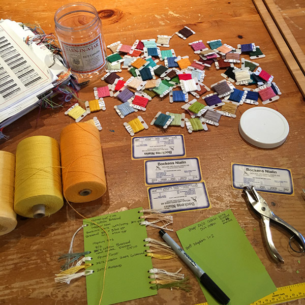
Designing another set of napkins. Photo credit: Elisabeth Hill
I had settled on the cottolin not only because of the nice selection of yellows I happened to have but also because it has a sturdy rusticity that I really love for my household. Now, with yarn and rough concept in hand, I needed to go back to the "drafting " board and redeem myself from the huck debacle of '17.
To be continued . . .
A man's [weaver's] mistakes are his [her] portals of discovery. - James Joyce.
—Elisabeth Hill