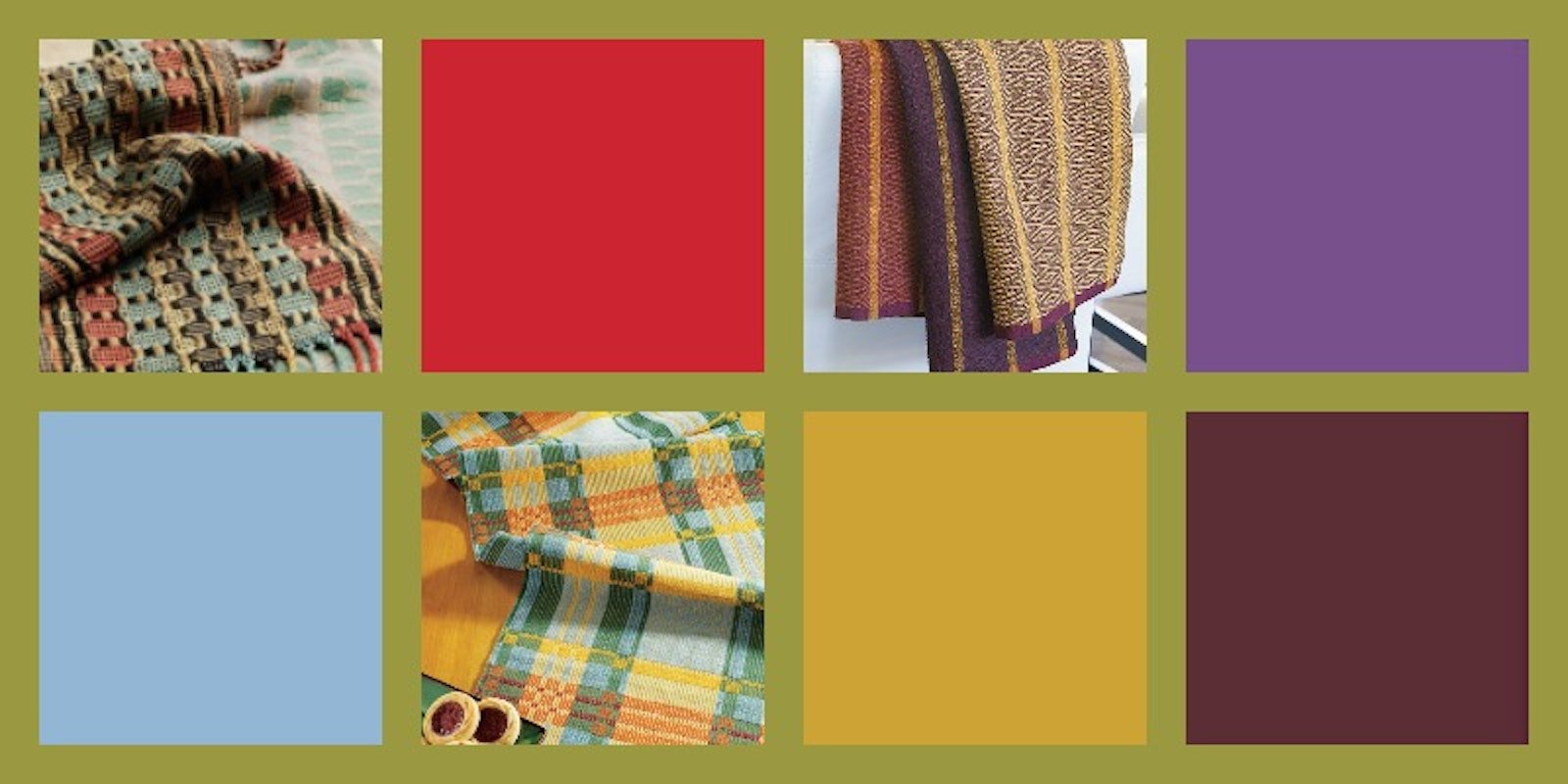
When I was a kid, there were only a few appropriate autumn colors: brown, yellow, brown, red, brown, and orange. Now don’t get me wrong, I love beautiful chocolate browns and warm burgundies, but this limited color palette never really did it for me. I’m so happy to say times have changed, and after looking at Pantone’s 2017 Fashion Color Report for fall, I am genuinely excited about the bright autumn color trends.
To build this particular color report, the color experts at Pantone looked at the top 10 colors found at both New York and London Fashion Weeks, and specifically at the autumn lineups at each show. The result is two bright and beautiful palettes that stay true to tradition with colors such as Tawny Port and Autumn Maple but also keep things lively with Golden Lime and Royal Lilac.
In honor of this bold and beautiful palette, here are a few of my favorite Handwoven projects that showcase these autumnal hues.
Moscow Nights Tea Towels
These 8-shaft twill towels by Jenny Sennott were based on a weaving draft from imperial Russia and woven in colors inspired by that time period. They also happen to showcase how perfectly Tawny Port, Royal Lilac, Lemon Curry, and Grenadine can work together to produce towels that are subtle and elegant. I’d happily use these towels at my next Thanksgiving.

Halvdräll Runner
The first time I saw this 4-shaft halvdräll runner by Rita Hagenbruch in the November/December 2011 issue, I fell in love. The colors, the pattern, the yarn—everything about the project appealed to me. Six years later I still love this project and the way it uses Autumn Maple, Blue Bell, Flame Scarlet, and Lemon Curry to create a runner that beautifully balances warm and cool hues. In a way, that’s a great description of the perfect autumn: a balance of warm days and cool nights.

Bumpy Bamboo Scarves in M’s and O’s
Last but certainly not least is this top scarf from Barbara Layton Rucker’s project Bumpy Bamboo Scarves in M’s and O’s. This 4-shaft scarf is so modern looking that it’s hard to believe it’s from the January/February 2010 issue of Handwoven! The way Barbara uses her palette to emphasize the texture of the Ms and Os is so clever, and I love how the black emphasizes the Yellow Curry, Blue Bell, and Grenadine. Just be careful wearing this scarf around other weavers—it’s the kind of project that just calls out to be touched!

So there you have it: three projects that showcase this fall’s Pantone Fashion Color Report in very different ways. I hope you love these projects and Pantone’s palette as much as I do—and I hope they inspire you to weave something wonderful!
Happy Weaving, Christina


